Product Management UX/UI & Interacion Blog — Frank derFrankie Neulichedl

Share: The Icon No One Agrees On - BOLD by Pixelapse

Maybe one of the most complete collection of thoughts around the sharing icon variety. And a nice discussion in the comments - what is not that common.

Share: The Icon No One Agrees On
And why iOS 7's icon is nicknamed the "uploader" - What do each of these symbols have in common? They are all trying to convey the exact same action - share! Sharing to a social network or via email is a ubiquitous action nowadays but designers have still not been able to reach a consensus on what symbol to use to represent it. Not only does each major platform use a different icon, but they've each witnessed changes over the years.I have spent ...

Extend your website with usefull sharing

Sharing Buttons seem so 2006 but we still add them on websites - for the eventuality of virality. There are some scenarios where you what to share content - mostly content bits. On AndroidPit we added sharing to App Questions, because those are relatively small content bits which people want to share.

Another strategy is the one the Guardian uses - offer sharing when you select text. Great idea, but you need for sure some on-boarding to make this feature discoverable.

#ux #ft #link

Originally shared by +Wolfgang Blau

by the way: select any word or sentence on the new Guardian site and you can tweet or email it right away.
see at www.theguardian.com/us
Thx to Richard Nguyen and +Cantlin Ashrowan


Material Design Implementation Clarification

There is still some discrepancies between the Guidelines, Checklists and the actual Google Apps, but these slideshow helps close a couple of gaps - especially in the typography realm.

Check it out.

#link #materialdesign #fixed

Originally shared by +Chris Banes

Papercraft: Material design + Implementation

Here are the slides to the talk +Nick Butcher and I just gave at +droidcon London.


In Album Papercraft: Material design + Implementation

Google Analytics integration Demo Site

Want to build a dashboard for all your Websites running Google Analytics? Want to embed some stat in a online report for your CEO - I think here you can find the right examples.

#link #Google #googleanalytics

Originally shared by +Google Analytics

Discover the Google Analytics Platform

We've just launched a brand new site to showcase many of our most popular Google Analytics demo and tools. The entire site is open sourced, uses public APIs, and is available on GitHub. Check it out and let us know what you think at: http://goo.gl/Yu1xaa


Most Popular Google Play App Categories 2014

This is not your standard chart based on app numbers per categories. This chart is based on data from 342.000 Apps isntalled on over 100.000 Devices recorded from April-October 2014. This gives a better overview on what on how popular a category is with smartphone users - not just how popular it is with developers. If you go by lists from Appbrain or App Annie you might think that Business, Photography and Social are hot categories ... but they are not or even worse, they have plenty of downloads, but only from  a few apps. Trying to push an app in these categories might be very difficult. I did not lump Games into one value here to give the full picture - but all game categories combined is about 50% larger then Tools, the single most popular app category. And here is the list:

  1. TOOLS
  2. PERSONALIZATION
  3. EDUCATION
  4. ENTERTAINMENT
  5. LIFESTYLE
  6. BOOKS AND REFERENCE
  7. TRAVEL AND LOCAL
  8. GAME,PUZZLE
  9. NEWS AND MAGAZINES
  10. MUSIC AND AUDIO
  11. PRODUCTIVITY
  12. GAME,CASUAL
  13. BUSINESS
  14. GAME,ARCADE
  15. FINANCE
  16. APPLICATION,SPORTS
  17. COMMUNICATION
  18. HEALTH AND FITNESS
  19. SOCIAL
  20. TRANSPORTATION
  21. SHOPPING
  22. MEDIA AND VIDEO
  23. PHOTOGRAPHY
  24. MEDICAL
  25. GAME,ACTION
  26. GAME,CARD
  27. GAME,RACING
  28. GAME,SPORTS
  29. APPLICATION,WEATHER
  30. GAME,EDUCATIONAL
  31. GAME,SIMULATION
  32. GAME,FAMILY
  33. GAME,ADVENTURE
  34. GAME,STRATEGY
  35. LIBRARIES AND DEMO
  36. GAME,TRIVIA
  37. GAME,CASINO
  38. GAME,ROLE PLAYING
  39. GAME,BOARD
  40. GAME,WORD
  41. COMICS
  42. GAME,MUSIC

Generate Android Assets with new Photoshop CC Extract Tool

The newest Photoshop CC 2014 update brings a new tool for Android and iOS Developers to extract the assets you need in the various screen resolutions. Since Adobe is always leaning towards iOS/Apple than Android the preset settings are geared toward iOS. Here is the quick 6 step workflow to make it work for Android.

  1. Create your Assets for the highest resolution (xxhdpi right now) and rename all the layers to the filenames you want to give. Make sure that all you layers are vector based or converted to smart-objects extracte_assets_step1
  2. Resize your document to mdpi = 33% (if you start resolution was xxhdpi) extracte_assets_step2
  3. Then, choose File > Extract Assets (or use the keyboard shortcut Cmd + Option + Shift + W (Mac) | Ctrl + Alt + Shift + W (Win). Go into Settings and set the resolutions like this extracte_assets_step3 extracte_assets_step3b
  4. Extract the assets by clicking extract extracte_assets_step4
  5. Go into the folder with the assets and create a drawable-mdpi folder
  6. Move the mdpi assets in the root of the folder to the drawable-mdpi folder extracte_assets_step5

Coldplay does it right - live concert, without video, but live social stream

Great move from Coldplay - stream their concert live. You might say, that's not news, but they do a couple of things right. http://www.coldplayaustralia.com.au/#/social-feed

First, they use a dedicated site they own, instead of one of the big companies. So I imagine, that the site will be still there when you read this post.

Second, they have a social stream and photos to give you beyond the music a way to experience it. In my opinion in a better way than even video would do.

Cleaned up Google+ Photos interface

Just noticed today that Google has cleaned up the photos section of Google+. No more confusion between Highlights and a Photo Stream. The show more images button has changed and the now everywhere present "card" background appear only on hover. The interface of the single album view has also been optimized. Now there are simple buttons for switching between Highlights and "all Photos" - this has been quite hidden before - and the properties are easier to access. If you click on the name for example a modal window shows up.

It shows that some of the sleeker design decisions have not been accepted well it seems. A reminder to us UX Designer to continue to improve and test our designs.

Android Webview Complex Table Problems solved

Android Webviews are a great way to display content from a website. So most websites that have a companion app use webviews to show the comment. And most of the time everything will work just fine - but if you use advanced table layouts you might encounter a problems.

The culprit is .setLayoutAlgorithm(LayoutAlgorithm.SINGLE_COLUMN);

Normal tables don't seem to be affected by this setting, but complex tables using scope="row" or scope="col" or both. To fix this just replace the LayoutAlgorithm to normal.

Example:  mMessageContentView.getSettings().setLayoutAlgorithm(LayoutAlgorithm.NORMAL);

Thanks to Stackoverflow: http://stackoverflow.com/questions/14624841/webview-is-not-displaying-table-properly-in-4-0-in-android

DNG files now supported by Google+ Photos - but not results may vary A couple of weeks ago we've heard...

A couple of weeks ago we've heard that raw conversion for a couple of cameras has been updated and I wanted to see if DNG files are supported. They are, but the results may vary.

Here are the results from uploading the DNG and a straight out of camera JPEG of one picture.

If you turn off auto-enhance you might like the JPEG more - it has more color in it and it doesn't look as neutral. But after enabling auto-enhance you get to see that the DNG conversion has more structure and better details in the shadows, they JPEG looks muddy.

This different results may not be as visible on daylight photos - I have to make more tests.

I would love to see that they would apply the auto-enhance on the raw file before converting it - so updates to the engine would be reflected in your pics, but the tool is not for raw shooters.

via Public RSS-Feed of Frank Neulichedl. Created with the PIXELMECHANICS 'GPlusRSS-Webtool' at http://gplusrss.com https://plus.google.com/116114203998112257616/posts/bAiPj8UYvgu

Club Sparkasse Logo and Collateral Design

The Client

The Sudtiroler Sparkasse is a regional bank with 122 branches distributed in 11 provinces in the north of Italy. This wide presence further enables the bank to serve the needs and interests of private and business clients. It also has expanded to others countries with branches in Austria and Germany.

The Brief

Sparkasse wanted to introduce the Sparkasse Club. This club initially open only to shareholders assigns bonus points in base of the number of shares and products a member has. This bonus points can be redeem at partners or special events. The whole system has to be communicated and  a logo has to be designed for the club.

The Solution

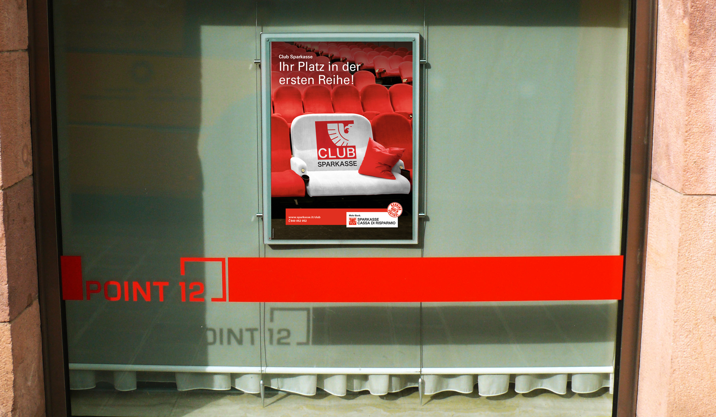
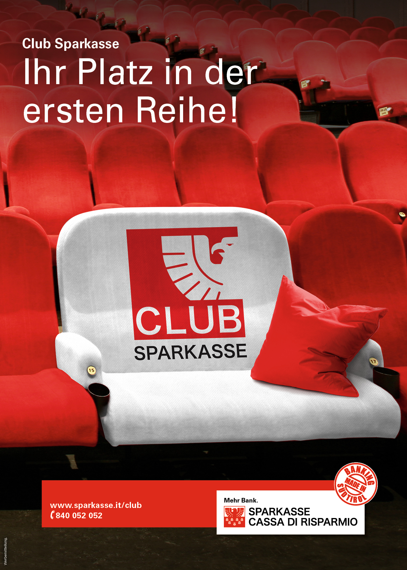
The logo is inspired by the recently redesigned logo for the Sparkasse. It has a stronger visual while keeping the main elements - it's modern, bold and the association to Sparkasse is clear. The key visual idea is "Club Sparkasse gives you the special treatment" - You sit in the best seats with extra  perks. It plays on the saying to "seat in the first row". The key visual was used in posters, ads, the partner brochure and the website.

Client: Südtiroler Sparkasse Agency: Gasser Design Project: Logo and Collateral Design Main Duties: Naming, Logo Design, Collateral Design, Web Design, Key Visual

[skillgroup][skill amount=75 name=Naming][skill amount=100 name=Logo Design][skill amount=55 name=Collateral Design][skill amount=100 name=Web Design][skill amount=85 name=Key Visual][/skillgroup]

Youtube - my new home for video podcasts

I might be the last one to the party, but the fairly recent changes in the Youtube UI made it my home for many video podcasts. While I listen to most of my podcasts, some of them are video podcasts to start with and therefore are better suited to be watched (at least in part) than just listened to. What I like about the new Youtube interface is that is has put my subscriptions in the foreground and has elevated the Watch later Playlist (which I still use) with the "What to Watch" Page where I can see selected content from my subscriptions. The addition of "topics" you can subscribe to is also very handy to discover new channels.

Add this to the ability to watch them through a Chromecast / PS3 / XBox etc on a big screen and you get a great "platform" for enjoying video content about topics you care.

PS: As offline capabilities  are rumored for the Android App, I guess it will become even better.

Autoawesome is awesome - even if you are a good photographer

Speyer Dom A great dome and a great autoawesome - I'm still amazed about the new features and makes me really think to rework my workflow. Obviously not all of the images look perfect, but many are and especially if you are an amateur photographer you will get even better results.

I've seen that random snapshots are improved, but the photos taken with a bit more care really shine. It seems that Google is looking for rules of thirds etc. to select and improve the photos - so still keep an eye on good composition etc.

About the church. Don't get confused by some reviews on Google and elsewhere - its strength is the size - get lost in the vast space and take a bit of time to adsorb the little details. It might look simple but there are enough ornaments hidden.