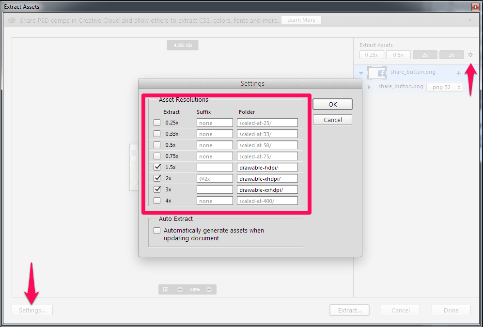
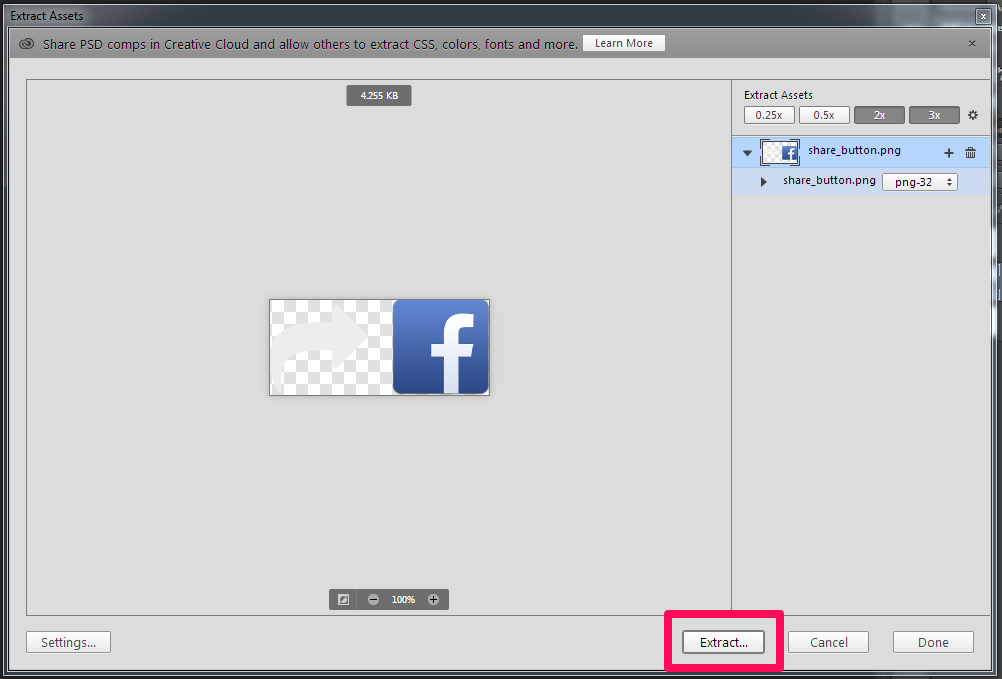
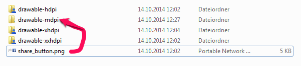
The font was designed for smartphone screens, but I will try it out for other screen designs as well - the screen density is similar.
#font #android #opensource #roboto
Reshared post from +Matias Duarte
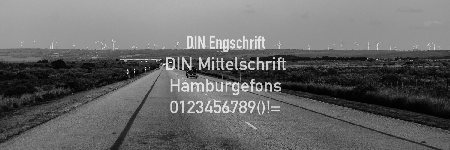
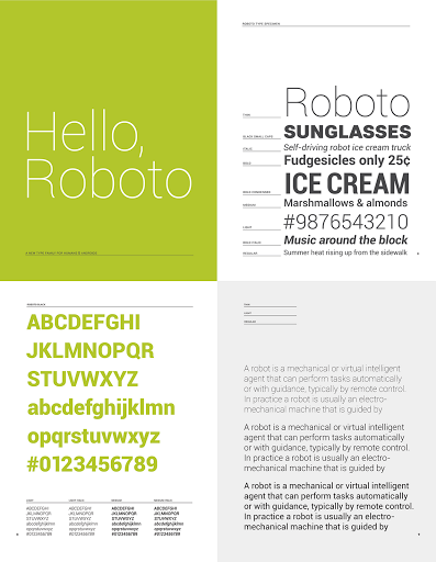
Hello Roboto
When we announced Ice Cream Sandwich I also got a chance to introduce Android’s new typeface Roboto. Today I’d like to talk about how Roboto was born — why we decided to create it, and the design choices we made in the process.
Why replace Droid?
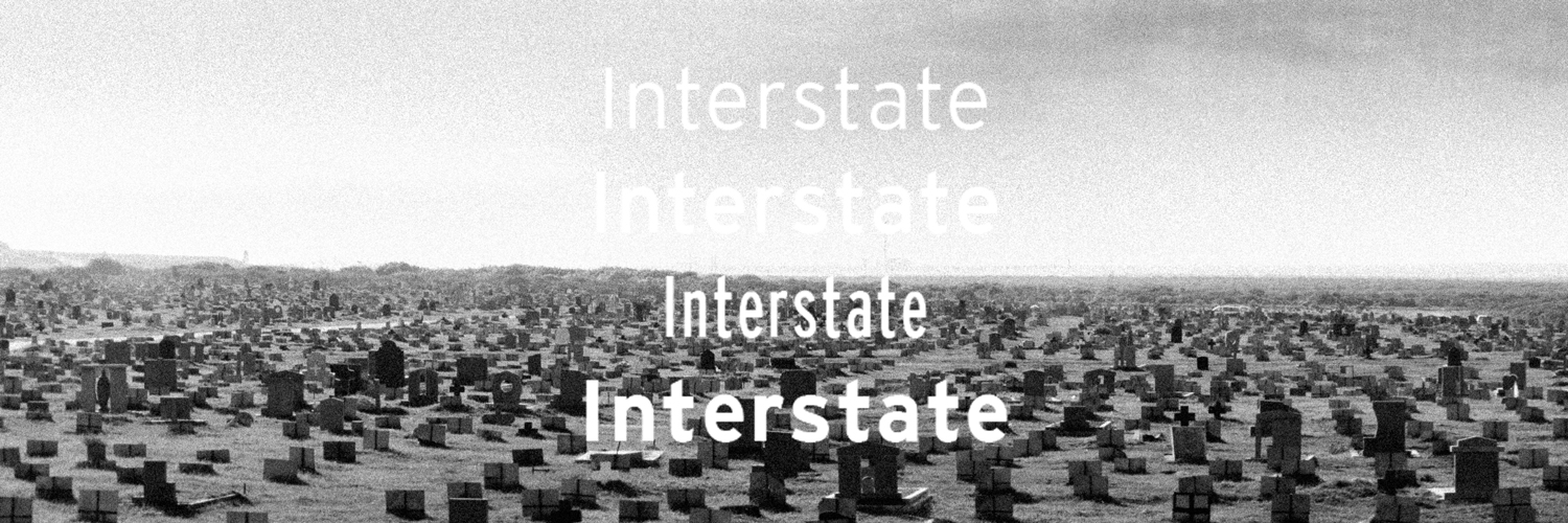
Droid is a great font family which served Android well over the years, but it was designed and optimized for screens that were much lower in pixel density than today’s HD displays. To be legible at smaller sizes, and to avoid turning to anti-aliased grey mush, the letter forms had to be quite dramatic. They had a tall x-height and a very regular rhythm so that they snapped to the pixel grid crisply. The bold variant was significantly wider than the regular text, because when a letter’s vertical strokes are one pixel thick, the only way to be bold is to double! It’s no surprise that on high rez screens, and at larger more dramatic headline sizes, Droid struggled to achieve both the openness and information density we wanted in Ice Cream Sandwich.
What were we looking for?
Most important was to create something that matched our ambitious design goals for Ice Cream Sandwich. Emotionally we wanted Ice Cream Sandwich to enchant you, to be attractive and eye-catching. Our new typeface had to be modern, crisp, and structured to match our new emphasis on open layouts and rigid grid alignments, but also friendly and approachable to make Android appealing, and a little bit more human.
Interactive display is a new and still evolving medium and what it demands from type design is subtly and uniquely different from print. We wanted to take maximum advantage of ultra high density screens like that of Galaxy Nexus, yet still be crisp and legible on lower resolution displays like that of Nexus S. Because Roboto would be used for the UI we wanted to make the bold very similar to the metrics of the regular weight, so that text could gracefully switch from bold to regular (like when you read emails in your inbox). We also wanted to include tabular figures (numbers that are all the same width) so we could display times, dates and other counters without having the characters jump around.
Finally we wanted Roboto to make a design statement in and of itself, in the same way that we wanted every screen on the device to have a strong and unique design point of view. Yet, just like the rest of the UI, Roboto is ultimately a medium for your content. We wanted Roboto to have a design character that made it recognizable, to be distinctive when you were paying attention, but never be overbearing or distracting.
How did we make it?
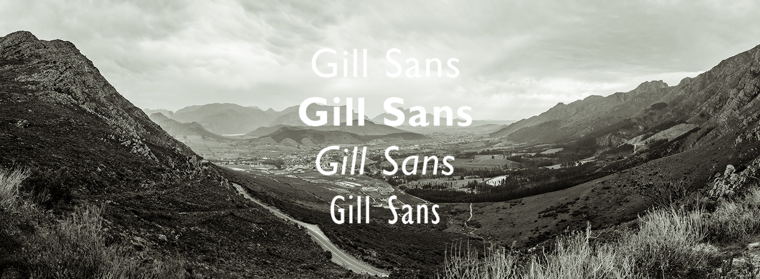
We realized early on that we needed something with a strong geometric backbone to hold up to our new open “Magazine UI” layouts. When we got rid of the boxes and bevels, dividers and other structural crutches, the more humanist fonts of our legacy felt uncomfortable and a little chaotic. Naturally we looked at some of the circle based geometrics like Avenir and Futura, but they’re very demanding in the rhythm of their metrics and ultimately were a little too soft for the crisp corners that we were using in the UI. The breakthrough came quickly when we settled on a straight sided grotesk.
Roboto’s straight sided capitals and distinctive racetrack-shaped rounded letters turned out to be perfect for our needs in a system font. It is space efficient and and holds its own for the short terse messages that are so common in UI. It has a high degree of compatibility with legacy designs created for Droid, because in almost all cases the same size Roboto sets in the same amount of space. Yet because of Roboto’s more structured forms we can actually set it smaller and with tighter line spacing, allowing us to put more information on the screen without inducing claustrophobia.
One of the potential drawbacks of a grotesk font is that the structured evenness of the type can make it more difficult to read. We started by softening up the lower case letters, and then experimented with opening up some of the glyphs to get a more diverse rhythm. We found that by adding a little more diversity to the lower case the font become more readable. In particular, we opened up the ‘e’ and ‘g’ while keeping the ‘a’, ‘c’ and ‘s’ characters closed. The rhythm starts to compare more to book types and makes for really nice reading over longer spans of text.
In the end we were iterating ceaselessly on minor details of the letters, extending the character set to Greek and Cyrillic, and tweaking the rendering so that Roboto would look just as good at all sizes and resolutions. In fact our work is not yet done as we continue to extend the character set and begin to hint Roboto so it works as well on computers as it does on Android devices. Still, I’m terrifically proud of the work the team and our lead typographer did in an ludicrously short amount of time. Roboto is a new foundation for Android and the team really deserves kudos for their accomplishment.
I hope you’ve enjoyed this little ‘behind the scenes’ peek at Android’s evolution. I had fun writing it, so let me know if you’d be interested in hearing more.
Google+: View post on Google+

 How to Not Freak Out About Material Design
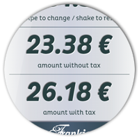
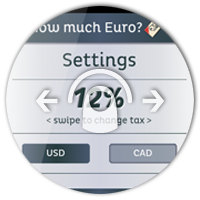
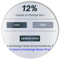
 Download "How much Euro?" on Google Play
 It's done, my first Android App has been submitted to the Android Marketplace. I must admit that I'm proud of myself - it's the first time in years, that I have breached into a new "medium". By that I mean, that I feel the rush to have published something in a way I have never done before, much like the first time I uploaded a website to a server back in 1996, or when my first "Hello World!" was printed on the screen with my C64.