Data Visualization — Product Management UX/UI & Interacion Blog — Frank derFrankie Neulichedl

Data Visualization

Space visualization inspires and can educate

I remember browsing through the library of my parents and since my dad is an engineer we had not only books about the "achievements of technology" but also books about space flight and the mission to the moon. The graphical language of this books and the illustrations have build my visual taste. I find it personally important to expose children and youngsters to a variety of visual languages and with the right guidance to art. While I despise most of the art circle the works of the masters can touch and inspire everyone.

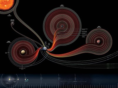
The illustrations featured here from NASA are maybe not masterpieces but they are good examples of how you can make dull facts interesting while not dumbing down the message or falsifying it. This way they can inspire graphic designers to create better visualizations and readers to get excited about spaceflight.

Darrell Hudson's profile photoDarrell Hudson originally shared this post:
You may find these Space Missions Infographics interesting to view. I combined them into this collection set. Some of the images are very wide so I split them in two images for improved aspect dimension. The larger photos are located at the end of the album. Most of the images are found at the NASA website. Don't forget to visit the +NASA Google+ page. Oh yea, one more mention +Ron Garan is a NASA Astronaut.

www.nasa.gov/missions/index.html

#infographic #space #nasa

Google Analytics visualizes data the "Napoleon's March" way

Google's Analytics tool provides many insights - if you know what to look for. The new visualization reports should help people to understand more easily what is going on. It's basically a revamped path visualization like the one found in funnels, but available to all pages. Looking forward in using this tool. Reshared post from +Danny Sullivan

If you do graphics, you'll know about the famous Napoleon's March illustration from 1869 that shows how his army was wiped out. Now, Google Analytics lets you do the same charts for your own site, but hopefully with a better ending!

Embedded Link

Google Analytics Gains "Napoleon's March" Flow Visualization Charts Google Analytics announced a new set of reports that should help marketers and website owners to understand how users behave on their websites. The feature was presented this morning during Web 2.0 Su...

Google+: View post on Google+

Government Spending Explained in Household Terms

While there are enough Families with problems in their own household finances, the US Government really is in bad shape if you apply a "normal" view. #government #spending #data #visualization

Reshared post from +Joseph Pred

Here is why S&P downgraded the US credit rating.

• U.S. Tax revenue: $2,170,000,000,000 • Fed budget: $3,820,000,000,000 • New debt: $ 1,650,000,000,000 • National debt: $14,271,000,000,000 • Recent budget cut: $ 38,500,000,000

Now let’s remove 8 zeros and pretend it’s a household budget.

• Annual family income: $21,700 • Money the family spent: $38,200 • New debt on the credit card: $16,500 • Outstanding balance on the credit card: $142,710 • Total budget cuts: $385

Google+: View post on Google+