Analytics — Product Management UX/UI & Interacion Blog — Frank derFrankie Neulichedl

Analytics

User friendly Google Analytics Reports - aka Dashboards

Dashboards are used in many CRM (Customer Relation Management) Solutions to give a quick overview over the most important Data on one page. Often also called "Scorecards" these Dashboard give you broad indicators and detailed information at the same time.

Google Analytics has some Dashboard functionality, but the standard reports are too detailed for the normal user (=your client), and the important information is not often visible at first. The famous "what does this mean" is basically transforming these reports into meaningful ones.

Dashthis helps with this process. Even the Google Analytics Blog writes about them, so have a read and check them out.

http://dashthis.com

#analytics #dashboard

Embedded Link

Google Analytics Blog: Sharing Personalized Dashboards using the Analytics API Web agencies often rely on Excel and Word to create analytics reports for clients. It's a manual process that involves a lot of copy and pasting. Yet an agency's main value-add isn't repor...

Google+: View post on Google+

Custom Report for Google Analytics to see impact of encrypted searches

Looking at the Keywords of your site statistics are one of the first things web designers/owners do to see, what people are looking for on the site. The latest changes in Google's Policy to encrypt searches will impact this key measure - but how much?

Check out this cool tutorial on how to see the impact or just click directly on the link of the custom report and add it to your Google Analytics Account.

http://goo.gl/UuKY0

#Analytics #Encryption #Google #SEO

Reshared post from +Avinash Kaushik

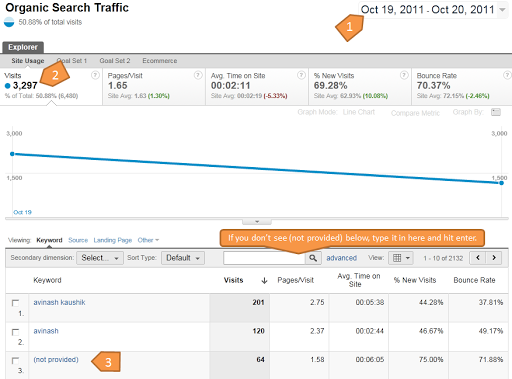
Estimate the impact of recent Google http > https change for logged in users on your search keywords.

Step 1. Open Google Analytics (or any tool you have access to).

Step 2: Go to Traffic Source > Sources > Search > Organic

Step 3: Change the Date Range (top right) to Oct 19th - Oct 20th (yes real time! :).

Step 4: Look for a keyword called: (not provided)

Step 5: Compare the total Visits (in the scorecard under the word Explorer on top) with the Visits you see in the row called (not provided).

Step 6: Use your own data, rather than FUD to: A. Worry a lot. B. Not worry at all. C. Wonder if you are suddenly hungry.

Screenshot for my blog attached.

#datadrivenfreakingout :)

PS: You should be able to do this with every web analytics tools including the main ones like Omniture, WebTrends, Yahoo! Web Analytics, CoreMetrics, Baidu Analytics et al.

PPS: Inspired by Thomas's comment below I've created a special custom report in Google Analytics that you can use to keep track of the impact of this change over time. Log into Google Analytics first, then click on this link to download the report: http://goo.gl/UuKY0 .

Google+: View post on Google+

Google Analytics visualizes data the "Napoleon's March" way

Google's Analytics tool provides many insights - if you know what to look for. The new visualization reports should help people to understand more easily what is going on. It's basically a revamped path visualization like the one found in funnels, but available to all pages. Looking forward in using this tool. Reshared post from +Danny Sullivan

If you do graphics, you'll know about the famous Napoleon's March illustration from 1869 that shows how his army was wiped out. Now, Google Analytics lets you do the same charts for your own site, but hopefully with a better ending!

Embedded Link

Google Analytics Gains "Napoleon's March" Flow Visualization Charts Google Analytics announced a new set of reports that should help marketers and website owners to understand how users behave on their websites. The feature was presented this morning during Web 2.0 Su...

Google+: View post on Google+