Now that's animation that make sometimes sense - but give that subtle extra that simple css cannot do. Love it.

Some inspiration for elastic components with SVG shape animations for enhanced UI interactions.


Product Management
UX/UI & Interacion Design
Thoughts and Links
Now that's animation that make sometimes sense - but give that subtle extra that simple css cannot do. Love it.
Some inspiration for elastic components with SVG shape animations for enhanced UI interactions.
Open Sourced Logo Design - Example io.js
True to it's open source nature io.js is using the Github Issue tracker for design proposals. It's not too far from what I use every day, but seeing it out in the wild is cool.
It also surfaces the problems: the wildness and the luck of structure., Design is not just a collection of finished artifacts - it's an evolution. And while you can follow the comments and the new interpretations it's not as perfect as I would like.
There are some books out there trying to help you find matching headline and body texts ... this online tool tries the same - it's not perfect or complete in any way, but it is a beginning.
Try it for yourself.

Find the perfect font combo for your next project. Abril Display, Adelle, Adobe Caslon Pro, Adobe Garamond Pro, Alternate Gothic No. 1 D, Alternate Gothic No. 2 D, Atrament Web, Bebas Neue, Brandon Grotesque, Calluna, Chaparral Pro, Chivo, Comic Serif Pro, Courier Std, DIN Condensed Web ...
Mashable launched today it's redesigned website. The one thing that captured my eye the most was actually how they implemented sharing. Not only do they have the classical sharing counts and buttons for the page, but also for quotes and images. Great idea, since we always want to just share a bit of the content or maybe a image etc. Well done.
Allessandro has made a good write up about responsive web design and analyzed some examples - the only problem I have is that he falls into the device/breakpoint trap as many do - me included. Most responsive website just look great at certain screen sizes - a normal Laptop Screen, the iPad, the iPhone ... everything in between looks often akward.
If the design has fixed widths then we generate white space (therefore the many minimal designs) or if we have fluid designs, we get strange overlays when sidebars don't move to the right place or we have too long text lines, that make the content unreadable.
And there will be more viewers with odd screen sizes than we have now in the future - so most of the responsive websites of today will be redone in a couple of years when they become unbearable.
Another downfall of responsive is that it's not so easy to optimize the user experience because you are bound to the same structure. If you have to load a new page on the desktop, you have to load it on the mobile view as well. I'm still on the boat of having separated mobile sites if you have major functionality changes ... if not than responsive is good enough. #responsive #design #webdesign
Embedded Link
Responsive Design: One Design for Each Job: Not Enough! For any web designer, thinking responsive means accepting a new challenge: to be creative not only to produce something that works well on desktop PCs, but also on tablets and smartphones; to create n...
Google+: View post on Google+
 It's done, my first Android App has been submitted to the Android Marketplace. I must admit that I'm proud of myself - it's the first time in years, that I have breached into a new "medium". By that I mean, that I feel the rush to have published something in a way I have never done before, much like the first time I uploaded a website to a server back in 1996, or when my first "Hello World!" was printed on the screen with my C64.
I also felt the same when I saw the first leaflet I designed lying on a counter in a bar - this "I did that, it's my creation and others use it actually".
That someone "uses" something I created is probably the most important part and the most exciting. In all my work, may it be design or development I always try to make something useful (I'm not against beauty, but a chair on which you cannot sit is pointless to me).
An App (native or on the web) is therefore the perfect medium for a "digital product designer" - someone who lives on the bridge between design and development. It contains not only design elements, but usability, development challenges and real world interaction (sometimes). People do not just "visit", they "use" the application.
This excitement will probably fade over time, but I try to keep this excitement alive by learning new stuff all the time. It is the excitement that keeps me searching for new challenges.
How about you, are you still exited about your work? How do you keep the passion for it going?
PS: Here is the link to Google Play
https://market.android.com/details?id=bz.frankie.howmucheuro
Google+: View post on Google+
Ok, not with every mouse - but with this new mouse from LG you can scan in a casual fashion. There have been hand scanners in the past, but the software wasn't that flexible. I like this approach very much. I find it especially useful for home offices, where you need to scan sometimes something but don't have the space for a full flat bed scanner.
#products #design #innovation #ux
[asa]B0053T0HNI[/asa]
Reshared post from +Giles Pettipher
LG Mouse/Scanner..
It's a Scanner in your Mouse...
Google+: View post on Google+
Great Article and poor comments - people ask for features when it's about a design process. Reshared post from +Google Maps
Ever wondered about the design process for Google Maps? Step behind the scenes and learn how two members of our user interface team, +Willem Van Lancker and +Jonah Jones, design the modern atlas. http://goo.gl/S691F

Google+: View post on Google+
I've tried the first iteration of the Berlin based startup called Wunderlist and I wasn't impressed. After Remember The Milk, Any.Do and the 1 million other task managers I tried I'm pretty spoiled. It seems to me that 6Wunderkinder didn't do their research work properly, as with many "new" products coming from startups solving "new" problems. They solve problems already solved - often times more cleverly or they don't solve them at all.
And Wunderkit has the same problem as ALL software has - it starts out nice and clean with just the minimum functionality because someone felt, that the current solution is too clunky and overloaded. In a second step they add functionality because the minimum set of features just meets the demands of a minimum set of customers - if you want to be sustainable and grow you need more customers and you have to meet their needs - by adding new features.
After a couple of versions you end up just as clunky and feature rich as the solution it was replacing.
As for Wunderkit the addition of social features is one that breaks the whole "get something done" principle and honestly the design is not readable not practical. It's nice to look at - if you don't care about design in it's real sense and I'm sure it fits nicely in the Apple world of "undesign" that all the iPhone Apps are famous for.
#taskmanager #startup #design
Google+: View post on Google+
I like this list, and especially that you could vote on the "before" logo as well. And there are more than one example where the old logo has got just as much votes as the new one. This means IMO that many re-designs are motivated by changes on the management level of the company/firm/... and not driven by necessity.
#corporate #identity #design
Reshared post from +Ian Hex
And now time for Part 2 from Brand New, this time: The Best Identities of 2011 -> http://goo.gl/UX8Wv
Of all the ones listed, I love, love, love the new OCAD University identity, because it embodies everything that should be done in modern-day identity design: it's simple and timeless, yet typographically pure, totally fluid, flexible and has a near limitless range of application; it's doesn't have to be consistent because it's coherent.
To be sure to check these out.
Also, happy to see the Little Chef redesign got on there.
#hex_logos-identities
![]()
Google+: View post on Google+
This is a great article for designers and users - balanced and well thought out. What it doesn't cover is why Apple and other firms are going towards skeuomorphic designs - maybe because they try to make technology for the "rest of us" by emulating the things "the rest of us" used in the past. This way we hinder real innovation, because this is not re-thinking a solution. #apple #design #UI
Embedded Link
Why Siri is like skeuomorphic UIs: the magic is just skin deep By now you've probably heard of the widely reported case of Siri's alleged pro-life stance. Walking the dogs this morning, I thought through what I
Google+: View post on Google+
Good interaction design has nothing to do with looks. Some interfaces look dreadful but work great, some look great but are painful to use. I often have to argue with fellow designers about how pretty or good looking a certain design is. Not only old school designers coming form print design (where I had the same discussions) have the impression that if something looks good, orderly and clean it also works well.
Even going beyond the taste of what looks good I often argue that the looks are a secondary thing and that we have to concentrate on the goal of the project - may it be to convey a message or to perform a task.
Google for example has been the posterchild for not being able to pull of a decent user interface - while the search page is probably one of the best UI decisions ever made.
Designers should remember that visual elements are meant to improve the user experience - looking good is part of that, but if it gets in the way of the goal it's a fail.
I will rest my case with this finding where in a test, the not so good looking vertical list has outperformed the nice grid view. It underlines another point - do test your designs.
#ui #ux #design #visual #testing
Embedded Link
westiseast.co.uk - Product listings - a surprising AB test result
These are the results of an AB test that finished recently on a product listing page - I think you'll find the results surprising.
Google+: View post on Google+
Easy as usual and now that just a couple of hours after the announcement everyone can create pages you might also link your website to this page. The icon used for the badge is actually not the black Google+ Icon we are used to now, but a red one - black for people and red for pages?
Now this is more than just a badge to put on your homepage next to Facebook and Twitter, but the tool also provides a link to put in your HTML Header to identify the website as a publisher and link it to that page.
I assume this will be used for display in search results on Google like it is done now for selected authors. I also am curious to see if there will be conflicts between author tags and publisher tags ... maybe both will be shown.
But the opportunity to het immediate followers on search results is great and makes sense.
#googleplus #design #microformat #link #pages
Embedded Link
Link your Google+ page to your site - Google+ Platform — Google Developers Google+ Platform. Overview; Plugins. +1 Button. Configuration Tool. Badge. Configuration Tool. Hangouts. Writing Apps; Running Apps; API Reference; Release Notes. API. People. get; search; listByActiv...
Google+: View post on Google+
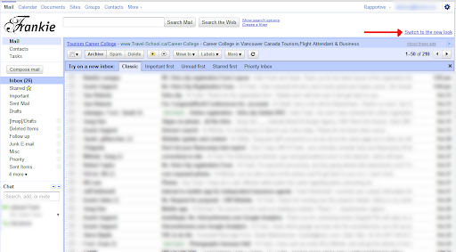
Google likes to move things around :) While in Gmail you can find the new link in the bottom right, in Gmail for Google Apps you can find it in the right top corner.I made a screenshot, so you won't miss it.
#Google #Gmail #design
Google+: View post on Google+
How many times have I heard a co-designer expess their desire to find a better [...] (insert external resource who delivers goods by specification of a designer - aka Developer, Printer or Print Shop, Media Buyer, ...). Not because the current service provider or vendor does a bad job, but the main reasoning goes like this: "They should get back to us with suggestions how we could make the [...] (brochure, website, catalog, mobile app) better, faster, smoother or more interactive by using the latest technologies - after all they are the experts of their fields." And in that reasoning lies already the answer - they are the experts in THEIR fields. An external service provider will always try to deliver your project with solutions they know well - therefore with the least amount of effort. They are not interested in making your project "more" anything - unless they have a ready solution to sell you at high margin for them - thus making it "more costly".
And this is rightly so - this is their business. It's not their business to find great solutions for the communication challenges of your client. So stop looking for this kind of vendor because you know them already - they are your competitors.
It's part of the job of a designer to research the latest technologies and materials to adapt them for the communication needs of their clients. It's important as a designer to know what is possible and what not - you don't have to know exactly how it is done, but at least now what there is. You have to push your vendor into new fields or find the right vendor for a specific job. You are the one who should know, because your client relies on you to get the best solution to his problem. Don't try to outsource your competence.
#design #workflow #outsourcing
Google+: View post on Google+
This website aims to build the visual language for the 99% movement, also known as Occupy Wallstreet. I find the idea interesting, and the icons are functional and the designs clear. But it also conveys that the 99% is a dull nameless mass - which is in my opinion in conflict with the diversity of opinions and goals of this heterogenous movement.
The website states that they try to unite the movement with an unified graphic language - but at the moment the language is not very unique. I think that the lowest denominator is not the best approach and there might be need for more thought and variety.
#OWS #design #Identity #style
Embedded Link
OccupyDesign Building a visual language for the 99%, grassroots style. Infographic + other protest signs, logistical signage, and universal icons to support the Occupy Together movement.
Google+: View post on Google+
A Book Apart, the excellent publishing company started by +Jeffrey Zeldman has published 2 new books today. They are inexpensive and always a great read - and for the first time also available as a bundle. This books are also a great read not only for designers and developers, but also for project managers and clients who want to understand what all the fuzz is about the latest trends in web design is ... they might skip the technical parts but grasp a broad view what to expect and what not.
#book #abookapart #epub #design #suggestion
Embedded Link
A Book Apart, Designing for Emotion & Mobile First Bundle Designing for Emotion & Mobile First Bundle. Designing for Emotion & Mobile First Bundle Designing for Emotion. View more images. Paperback bundle $30.00 + shipping + Add. ebook bundle $15.00 ...
Google+: View post on Google+
I read a lot about the importance of "less" features and better experience. The mobile first movement comes to mind and I can totally see that it makes sense to not get caught in a Featuremania, but sometimes one feature is more than important, even though it's small. Example: How Remember the Milk (a popular Todo-List App) got me back to their service
Remember the Milk has a lot of features, actually it had all the features I needed - Super Easy Task property input through shortcodes, Locations, Web Interface, Mobile App with Widgets, Automatic Syncing etc. but one ... You couldn't create a new task with the Android Share Menu from another App. This feature would have been super easy to implement and a small update would have fixed this.
The developer preferred to make a complete overhaul of the Android App (without telling anyone) and didn't update the App for months.
This made me look for other solutions and try about 10 other services and get really frustrated. Not only because the user experience was different with other services, but mostly because they where lacking one or another feature I used to love on RTM (Remember The Milk).
I settled for Google Tasks and a nice Mobile App to manage them, even though it lacked a nice web interface and the ease of adding Task properties with shortcodes - but it had the feature I was looking for - the Add Task through the "share menu" in Android.
And here comes the update to the Android App of RTM today ... a lot of bells and whistles and improved use experience, but more important for me ... the share functionality is included.
So I'm back on my favourite Todo-List App/Web Service ...
What I learned Designers are often focused on the experience and try to simplify the functionality to make a slick web/mobile app - but sometimes the little bit more on functionality is more important than the updated icon or slicker dashboard screens
#RTM #UX #Design #Development
Embedded Link
The ginormous Remember The Milk for Android update - Remember The Milk Blog ARCHIVES. October 2011; September 2011; August 2011; July 2011; June 2011; May 2011; April 2011; March 2011; February 2011; January 2011; December 2010; November 2010. View all archives, October 2011,...
Google+: View post on Google+
 logo ideas · Issue #37 · iojs/io.js · GitHub