UX — Product Management UX/UI & Interacion Blog — Frank derFrankie Neulichedl

UX

How to get the most out of type-ahead: Autocomplete and Autosuggest | Earley & Associates

Quick read with great impact?

How to get the most out of type-ahead: Autocomplete and Autosuggest | Earley & Associates
Many of today's ecommerce platforms offer the ability to create and curate type-ahead lists within the search box, some even including thumbnail images in addition to text. As the capabilities of the internet and Google make things easier and easier for the user, it is critical for anyone ...

Extend your website with usefull sharing

Sharing Buttons seem so 2006 but we still add them on websites - for the eventuality of virality. There are some scenarios where you what to share content - mostly content bits. On AndroidPit we added sharing to App Questions, because those are relatively small content bits which people want to share.

Another strategy is the one the Guardian uses - offer sharing when you select text. Great idea, but you need for sure some on-boarding to make this feature discoverable.

#ux #ft #link

Originally shared by +Wolfgang Blau

by the way: select any word or sentence on the new Guardian site and you can tweet or email it right away.
see at www.theguardian.com/us
Thx to Richard Nguyen and +Cantlin Ashrowan


Google+ launches new design - I like it

I'm curious to see if there will be the same outcry on google+ with the new design as you always hear on Facebook - but I like it. It is still clean but they have added a more App - Feeling. It seems that you can do more with Google+ now. The Toolbar on the lift is customizable and filtering your feed is also more intuitive.

I wonder if the page still consumes all the available memory of you computer if you leave it on in the background - will test that - but cudos in general to Google to improve quickly.

#googleplus #redesign #ux

Google+: View post on Google+

Will we use 3D for interaction on our websites?

I like technology demos - I like this one very much, especially the Michael Bay Clouds. But I try also to figure out if there is some immediate use for "normal" web interfaces, not just games. While I can see that cool animations would make a website more desirable, it would also make it slower to use - and if overdone maybe gimmicky.

Not to mention the whole mobile aspect ... yeah I know progressive enhancement - but should I recommend one of my clients to have a website using this technologies? Probably not.

#3d #CSS3 #UX

Embedded Link

CSS3D Clouds An experiment on creating volumetric 3d-like clouds with CSS3 3D Transforms and a bit of Javascript. Move the mouse to rotate around and mouse wheel to zoom in and out. Hit space to generate a new clo...

Google+: View post on Google+

Levelling up in an App or website?

While I'm catching up with some SXSW talks through my Huffduffer Account (don't tell me you are an avid podcast listener and you don't know about Huffduffer), I came across the talk Tapworthy Touchscreen Design. While most of the talk was pretty straight forward to anyone who is a interface designer, the concept of using a level system for an application of website was new and intriguing. Not the average gamification bla bla - but just like in a game, where you get more capabilities while you progress, you would setup the application to expose more and more functionality the longer a user interacts with it.

I still have to wrap my head around how you could use this in an extended way, but I can see immediately the advantage of an uncluttered interface in the beginning, which you then fill with more and more functionality.

#ux #interfacedesign #gamification #development

Embedded Link

Teaching Touch: Tapworthy Touchscreen Design Discover the rules of thumb for finger-friendly design. Touch gestures are sweeping away buttons, menus and windows from mobile devices—and even from the next version of Windows. Find out why those fa...

Google+: View post on Google+

Easy scanning without alignment just by swiping your mouse

Ok, not with every mouse - but with this new mouse from LG you can scan in a casual fashion. There have been hand scanners in the past, but the software wasn't that flexible. I like this approach very much. I find it especially useful for home offices, where you need to scan sometimes something but don't have the space for a full flat bed scanner.

#products #design #innovation #ux

[asa]B0053T0HNI[/asa]

Reshared post from +Giles Pettipher

LG Mouse/Scanner..

It's a Scanner in your Mouse...

Google+: View post on Google+

Good UI and webdesign does not mean prettier design

Good interaction design has nothing to do with looks. Some interfaces look dreadful but work great, some look great but are painful to use. I often have to argue with fellow designers about how pretty or good looking a certain design is. Not only old school designers coming form print design (where I had the same discussions) have the impression that if something looks good, orderly and clean it also works well.

Even going beyond the taste of what looks good I often argue that the looks are a secondary thing and that we have to concentrate on the goal of the project - may it be to convey a message or to perform a task.

Google for example has been the posterchild for not being able to pull of a decent user interface - while the search page is probably one of the best UI decisions ever made.

Designers should remember that visual elements are meant to improve the user experience - looking good is part of that, but if it gets in the way of the goal it's a fail.

I will rest my case with this finding where in a test, the not so good looking vertical list has outperformed the nice grid view. It underlines another point - do test your designs.

#ui #ux #design #visual #testing

Embedded Link

westiseast.co.uk - Product listings - a surprising AB test result

These are the results of an AB test that finished recently on a product listing page - I think you'll find the results surprising.

Google+: View post on Google+

The Version History of a website

How great is that - tracking the changes made to a website not a sense of content, but in functionality. Since websites are not longer just containers of content it makes perfect sense. Is it interesting to the visitor? Sure, here are a couple of reasons:

Feature Discovery Just like you are interested what are the latest features your favorite app has, website visitors are interested what they can do on your website. Especially if you have a lot of functionality that is not immediately visible.

Help Documentation While you add more and more functionality a website might need help documentation - it becomes in the end more and more an application. The Version History keeps a log of what features might need to be added to the help section or which description might be out of date.

Showing that you listen to users By having a version history you can show that you listen to suggestions of your users. Not all new features might be inspired by visitors to your site, but many will be and giving credit is a transparent way of showing your commitment.

Reduces feature redundancy It also gives you a place where you can look up if a similar feature might be already in place. If you are part of a big website with multiple developers and units the chances are high that you don't know all the functionality of the whole website - and you might want to add something which is already there. Even if the site is small you might take over from another developer/designer you might want to know why the site works the way it does. The version history shows you when and where new things got added and might give a hint why the CSS file is messed up the way it is.

It doesn't have to be public You can also make the version history just for yourself - as a reference when you introduced a feature. This can than later be used for measuring how effectively that introduction has been - have you met the goals you have set for the new feature (you have set goals right?).

These are just a few of the benefits I can see for the version history on a website, what are yours?

#website #ux #idea

Reshared post from +The Verge

We've got a Version History!

Embedded Link

Version History | The Verge

Google+: View post on Google+

Pluto Italics for just $49 - and how MyFonts could improve their User Experience [updated]

The world on typography is on fire - new fresh and great fonts are released every day. Just like the new Pluto Italics. Even better when you can get the fonts at a bargain price - say $49 for 16 fonts. And yes it is worth paying, because it's full featured Opentype with alternatives etc.

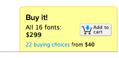
The only thing I disliked is the buying process - because the website states on the cart that the font package costs $299 - even though it shows you the right price once you click on the button. I head to try it out because on first sight even though the slider image tells me it's $49 the button does not - confusing.


Embedded Link

Pluto Italics™ - Webfont & Desktop font « MyFonts Type designer Hannes von Döhren has created Pluto, a sweet type family consisting of 16 Uprights and 16 Italics; 32 fonts in all. The fonts are informal and friendly at first sight and lend themselves...

Google+: View post on Google+

[update]Myfonts has corrected the issue and the price is now shown correctly. Good for you.[/update]

Donwload Section for Mobile Sites? - 5 Tips for a better User Experience

It's good practice to have a dedicated download section if a website is for a business that provides a lot of technical information for download. Especially B2B websites use the websites as a resource for providing access to brochures, drawings, etc. But in this mobile first times even B2B sites get accessed by mobile devices and downloading a file to that device is not always the best experience. Here are 5 tips for a better User Experience

1) Include a "Send Brochure to Email" Button I often find information I want to read later when I'm at my computer - the ability to send it to my email account is an easy way to remember me to read it and I know where i can find the brochure - in the email.

2) Provide links to PDF-readers Adobe has extended it's free Acrobat Reader series to mobile devices, but unlike the desktops not all smart phones users have installed them. It's much like a years ago where every website had a link to the download section of Adobe Acrobat - just now the links are for the app stores. Here are the links to the current versions: - Adobe Reader for Android - Access PDF files on the go: https://market.android.com/details?id=com.adobe.reader - Adobe Reader X for iOS - Access PDF files on the go: http://itunes.apple.com/WebObjects/MZStore.woa/wa/viewSoftware?id=469337564&mt=8

3) Use a third party service like Isuuu I used Isuuu on many websites. Mostly where the business had a publication or catalog they wanted to make readable on the web without transferring all the content to the website. The causes might be workflow related or just because it was just cheaper.

Issue has redesigned it's online reading experience beyond their flash player to HTML5 and makes it accessible this way to mobile devices and tablets.

4) Give an alternative URL If the brochures just are other versions of the content already present on the website you might just publish a link and a note to direct them to that page.

5) Don't get rid of the download section If none of the above solutions work for you don't just get rid of the section. Visitors might know your site from the desktop version and expect to find the download section. Just have the section with some copy stating that you don't provide downloads in the mobile version with a link to the full website. I people really want to get to the downloads they can reach it.

This are just a couple of examples and it would be great to hear other ideas - what are your solutions? #UX #mobile #webdesign

Google+: View post on Google+

Why Feature Selection is so important - The Case Remember the Milk

I read a lot about the importance of "less" features and better experience. The mobile first movement comes to mind and I can totally see that it makes sense to not get caught in a Featuremania, but sometimes one feature is more than important, even though it's small. Example: How Remember the Milk (a popular Todo-List App) got me back to their service

Remember the Milk has a lot of features, actually it had all the features I needed - Super Easy Task property input through shortcodes, Locations, Web Interface, Mobile App with Widgets, Automatic Syncing etc. but one ... You couldn't create a new task with the Android Share Menu from another App. This feature would have been super easy to implement and a small update would have fixed this.

The developer preferred to make a complete overhaul of the Android App (without telling anyone) and didn't update the App for months.

This made me look for other solutions and try about 10 other services and get really frustrated. Not only because the user experience was different with other services, but mostly because they where lacking one or another feature I used to love on RTM (Remember The Milk).

I settled for Google Tasks and a nice Mobile App to manage them, even though it lacked a nice web interface and the ease of adding Task properties with shortcodes - but it had the feature I was looking for - the Add Task through the "share menu" in Android.

And here comes the update to the Android App of RTM today ... a lot of bells and whistles and improved use experience, but more important for me ... the share functionality is included.

So I'm back on my favourite Todo-List App/Web Service ...

What I learned Designers are often focused on the experience and try to simplify the functionality to make a slick web/mobile app - but sometimes the little bit more on functionality is more important than the updated icon or slicker dashboard screens

#RTM #UX #Design #Development

Embedded Link

The ginormous Remember The Milk for Android update - Remember The Milk Blog ARCHIVES. October 2011; September 2011; August 2011; July 2011; June 2011; May 2011; April 2011; March 2011; February 2011; January 2011; December 2010; November 2010. View all archives, October 2011,...

Google+: View post on Google+

New Google Feedburner UI spotted - a quick overview

Feedburner is a service for webmasters and website owners to track their RSS-Feed subscribers and much more. RSS did not make it to the general public as everyone hoped, but still are very important. Google bought the company behind Feedburner a couple of years ago and beyond a small integration into Google Analytics and Google Adsense nothing happened for years. Today I spotted the "Try the new beta" and here are some screenshots of the interface.

The new Dashboard features messages, your top items and top feeds.

The Feed list features a neat little graph of your reach. Note if you have more clicks than views you are using your rss feed on Twitter or Facebook.

The Feed overview is very well structured and gives you the ability to hide values from the chart. At the moment if you select all time in the date selector it shows only the last two month - I hope they will import the old data over from the classic Interface. But it's proof that they build it from scratch since they clearly have a new database as source.

The single Item display does not show much - but I'm sure they will improve this.

The Subscriber overview has just got more colorful, nothing special I can see here.

This on the other side is interesting. It shows you the endpoints (formerly known as "USE") where your items have been shown and clicked. It would be great if you could reach out to the url shorteners and import their data as well to see effective endpoints even for shortened urls.

All in all it loads quite fast and works well. It gives me a better overview and maybe I start to analyze my feed stats again.