
Spice up the bland Apple design
Apples design choices are not top notch anymore, some might say they are a bit bland. So why not update your system font with this free package.

Input is a typeface for code, designed by David Jonathan Ross and released by Font Bureau.
Animated Fonts, the next frontier
Typography is a beast - everyone uses fonts, they are integral part of every operating system and application, and still in 2012 the art of making type look good is in the hand of the creator. And here are now animated fonts to make it even harder beyond the new challenges that web fonts bring. Animated fonts make fonts even stronger in character and make them express a style and a story.
This will make it difficult to use these fonts beyond the classic script fonts or as a demo. One of these demos is Typogami. I think zou can just use it for a documentary about origami - at least in the animated form, but still - great idea and execution.
Download it for free on their Facebook page and read more about the font following the link.
#typography #animation #font #free #origami
Embedded Link
Typogami: A Free Animated Typeface Inspired By Origami If you like typography and origami, this should set your heart ablaze: Typogami has letters that look like they’re made from folded paper. Still not smitten? It’s customizable and animated. Designed b...
Google+: View post on Google+
Edding850 by Büro Destruct - Interesting font and interesting way to get it
Edding850 by Büro Destruct - Interesting font and interesting way to get itTo get this bold display font you need to write something on a virtual wall - and just like the real Edding (or sharpy as you might call it in north america) it cannot be deleted.
More Information on the project here: http://www.creativeapplications.net/webapp/edding-850-font-by-buro-destruct-collaborative-realtime-text-editor/
#font #creative #free #download #idea
Embedded Link
An edding can write anywhere I just wrote this on type-fortype.com. For every post on the collaborative text document, you’ll get something in return: the edding850 typeface.
Google+: View post on Google+
Everybody loves fresh free fonts - if they are high quality
Now what does high quality mean? For me it means rich character set for international use, suitable for print and web and that they have something that makes them individual. Also check out their older posts, totally worth it.
#typography #font #free #webfont
Embedded Link
14 Free and Fresh High-Quality Fonts (No.3 – 2012) | gonzoblog.nl In this last month there have been a lot of new and fresh high-quality fonts published, again. I have made a selection of fonts that are designed to be well suited for web as well for print, in partic...
Google+: View post on Google+
Layered font for old style appeal
I like this concept of creating a separate font for each style element. It helps to achieve a sophisticated look with a couple of easy steps. Nice - and the outline is available for free, almost you pay with a tweet.
#font #free #idea
Embedded Link
Frontage Typeface +freefont on the Behance Network Frontage is a charming layered type system with endless design possibilities.
Google+: View post on Google+
Optical Kerning for Webfonts - TypeButter
I'm happy to see that optical kerning has arrived for webfonts. I still see many designers avoiding optical kerning in print design and I wondered why that is. One reason could be lack of education, but then I discovered another thing. Bad fonts. Cheap fonts often lack the proper kerning pairs and are made in a way that freaks out the optical kerning algorithms so beware of cheap fonts and use optical kerning whenever it fits.
#font #webfont #kerning
Embedded Link
TypeButter | Optical Kerning FTW! TypeButter | TypeButter allows you to set optical kerning for any font on your website. If you’re longing for beautifully laid out text that today’s browsers just don’t provide, this is the plugin for you! Downloa...
Google+: View post on Google+
Contemporary free display font Archive
I like the all caps display font called Archive because it has a great balance in weight, modern elements and readability. As seen in the examples it works great if you age it, but I think it might show it's best use as a logo font for a tech startup that doesn't want to get lost in the see of soft shapes and script fonts.
#font #free #typography
Embedded Link
Free Fonts Download, Fonts for Free Our goal is to create high-quality Free Fonts which stand in a unique class of their own, and which will serve as a good base for any designer project whether it be web, print, t-shirt design, logo et...
Google+: View post on Google+
Let's get Ultrabold, with Bemio a new font from the Lost-Type CoOp
Bemio is an ultrabold sans with an extensive character set. It bridges the gap between old signage and craftsmanship with modern forms and simplicity. With more than 1000 glyphs, and full Language Support, Bemio is versatile and robust.
Embedded Link
http://www.losttype.com/font/?name=bemio&source=e
Google+: View post on Google+
Haas Unica typeface redraw Heltar introductionary price is 75% off
I always like a great deal when it comes to fonts - and this 75% off sounds pretty good to me. Offer code is TNB7563 and is sold at The Northern Block - sale runs until christmas. The font itself seems at first sight very similar to Helvetica, so it can be used as an alternative to that, but it has an edge, so it will get more attention - stick out and have people look at it twice ... and sometimes we just want that, don't we.
#font #type #helvetica #alternative #sale
Reshared post from +Ian Hex
Like me, I know that +Graham Smith has a love for neo-/grotesque typefaces. Today, I was alerted to Jonathan Hill's (thenorthernblock.co.uk/heltar.htm) redrawing of the elusive Haas Unica typeface; it's called Heltar -> http://goo.gl/9Ilx6
"Having grown up in Sheffield and been completely immersed in the work of The Designers Republic I became very drawn to their treatment of Helvetica, especially the close tracking of the letter space. This visual investigation led me to the study of the font Hass Unica, a so called improvement to Helvetica. In-order not to replicate and become a clone of Unica I redrew all the characters from scratch improving optical appearance, developing subtle corrections and reshaping individual letterforms. The result is a remixed neo-grotesque font that has strong general optical balance with great rhythm under close tracking."
The lowercase italic e is... interesting.
And, until Christmas, you can purchase the entirely family at 75% discount.
#hex_typography


Google+: View post on Google+
Behind the scenes of the new Android Standard Font Roboto
The font was designed for smartphone screens, but I will try it out for other screen designs as well - the screen density is similar. #font #android #opensource #roboto
Reshared post from +Matias Duarte
Hello Roboto When we announced Ice Cream Sandwich I also got a chance to introduce Android’s new typeface Roboto. Today I’d like to talk about how Roboto was born — why we decided to create it, and the design choices we made in the process.
Why replace Droid? Droid is a great font family which served Android well over the years, but it was designed and optimized for screens that were much lower in pixel density than today’s HD displays. To be legible at smaller sizes, and to avoid turning to anti-aliased grey mush, the letter forms had to be quite dramatic. They had a tall x-height and a very regular rhythm so that they snapped to the pixel grid crisply. The bold variant was significantly wider than the regular text, because when a letter’s vertical strokes are one pixel thick, the only way to be bold is to double! It’s no surprise that on high rez screens, and at larger more dramatic headline sizes, Droid struggled to achieve both the openness and information density we wanted in Ice Cream Sandwich.
What were we looking for? Most important was to create something that matched our ambitious design goals for Ice Cream Sandwich. Emotionally we wanted Ice Cream Sandwich to enchant you, to be attractive and eye-catching. Our new typeface had to be modern, crisp, and structured to match our new emphasis on open layouts and rigid grid alignments, but also friendly and approachable to make Android appealing, and a little bit more human.
Interactive display is a new and still evolving medium and what it demands from type design is subtly and uniquely different from print. We wanted to take maximum advantage of ultra high density screens like that of Galaxy Nexus, yet still be crisp and legible on lower resolution displays like that of Nexus S. Because Roboto would be used for the UI we wanted to make the bold very similar to the metrics of the regular weight, so that text could gracefully switch from bold to regular (like when you read emails in your inbox). We also wanted to include tabular figures (numbers that are all the same width) so we could display times, dates and other counters without having the characters jump around.
Finally we wanted Roboto to make a design statement in and of itself, in the same way that we wanted every screen on the device to have a strong and unique design point of view. Yet, just like the rest of the UI, Roboto is ultimately a medium for your content. We wanted Roboto to have a design character that made it recognizable, to be distinctive when you were paying attention, but never be overbearing or distracting.
How did we make it? We realized early on that we needed something with a strong geometric backbone to hold up to our new open “Magazine UI” layouts. When we got rid of the boxes and bevels, dividers and other structural crutches, the more humanist fonts of our legacy felt uncomfortable and a little chaotic. Naturally we looked at some of the circle based geometrics like Avenir and Futura, but they’re very demanding in the rhythm of their metrics and ultimately were a little too soft for the crisp corners that we were using in the UI. The breakthrough came quickly when we settled on a straight sided grotesk.
Roboto’s straight sided capitals and distinctive racetrack-shaped rounded letters turned out to be perfect for our needs in a system font. It is space efficient and and holds its own for the short terse messages that are so common in UI. It has a high degree of compatibility with legacy designs created for Droid, because in almost all cases the same size Roboto sets in the same amount of space. Yet because of Roboto’s more structured forms we can actually set it smaller and with tighter line spacing, allowing us to put more information on the screen without inducing claustrophobia.
One of the potential drawbacks of a grotesk font is that the structured evenness of the type can make it more difficult to read. We started by softening up the lower case letters, and then experimented with opening up some of the glyphs to get a more diverse rhythm. We found that by adding a little more diversity to the lower case the font become more readable. In particular, we opened up the ‘e’ and ‘g’ while keeping the ‘a’, ‘c’ and ‘s’ characters closed. The rhythm starts to compare more to book types and makes for really nice reading over longer spans of text.
In the end we were iterating ceaselessly on minor details of the letters, extending the character set to Greek and Cyrillic, and tweaking the rendering so that Roboto would look just as good at all sizes and resolutions. In fact our work is not yet done as we continue to extend the character set and begin to hint Roboto so it works as well on computers as it does on Android devices. Still, I’m terrifically proud of the work the team and our lead typographer did in an ludicrously short amount of time. Roboto is a new foundation for Android and the team really deserves kudos for their accomplishment.
I hope you’ve enjoyed this little ‘behind the scenes’ peek at Android’s evolution. I had fun writing it, so let me know if you’d be interested in hearing more.

Google+: View post on Google+
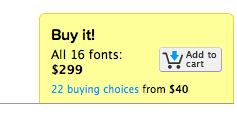
Pluto Italics for just $49 - and how MyFonts could improve their User Experience [updated]
The world on typography is on fire - new fresh and great fonts are released every day. Just like the new Pluto Italics. Even better when you can get the fonts at a bargain price - say $49 for 16 fonts. And yes it is worth paying, because it's full featured Opentype with alternatives etc.
 The only thing I disliked is the buying process - because the website states on the cart that the font package costs $299 - even though it shows you the right price once you click on the button. I head to try it out because on first sight even though the slider image tells me it's $49 the button does not - confusing.
Embedded Link
Pluto Italics™ - Webfont & Desktop font « MyFonts Type designer Hannes von Döhren has created Pluto, a sweet type family consisting of 16 Uprights and 16 Italics; 32 fonts in all. The fonts are informal and friendly at first sight and lend themselves...
Google+: View post on Google+
[update]Myfonts has corrected the issue and the price is now shown correctly. Good for you.[/update]
Great new fonts available at Typekit ... I looove FF Nexus
#font #webfont #typekit
Embedded Link
New FontFont web fonts Today, even more FontFont web fonts are available to host on Typekit: the FF Nexus superfamily, FF Karbid (in several optical styles), and FF Signa Serif. And augmenting your Typekit library subscr......
Google+: View post on Google+
For the Web-Font Lovers
Here is a foundry which offers great free fonts and have also Curated Font Packages. There is even a deal today on AppSumo for them - you might want to try that out http://kernest.com/
#webfont #offer & #free
Embedded Link
All your software in one nice little burrito | AppSumo.com Amazing deals on amazing websites. Come check it out!
Google+: View post on Google+


