Product Management UX/UI & Interacion Blog — Frank derFrankie Neulichedl

ft

Tindddle – Tinder for Dribbble

Lovely idea - making Dribbble user friendlier by using a usage pattern from another app.I just wonder if the second aspect of Tinder is also considered.

Tindddle – Tinder for Dribbble Using the Dribbble API, you can discover new shots from players in the community to get inspired and enjoy browsing Dribbble in a Tinder-esque way.

Wihnachtsmarktfahrplan

The newest trend (probably not only) in Berlin is to show Bars, Burger joints and christmas markets on the publi transport map .... nice trend but be aware there might be some walking involved.

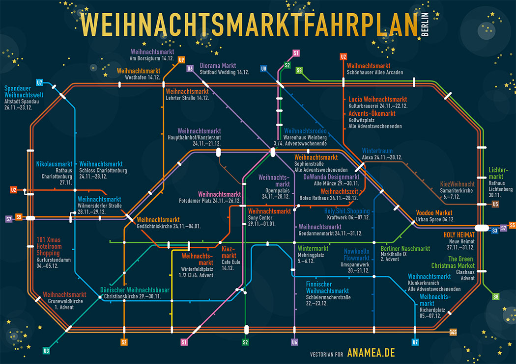
www.morgenpost.de/bin/weihnachtsmarktfahrplan-134669184.jpg

This is a nice A/B test - for lingerie sales

Comprehensive article, some great insight.

This Lingerie Company A/B Tests The World's Hottest Women To See Who Makes You Click "Buy"
All lingerie companies hire hot women to flaunt their wares. Adore Me goes many steps furtherand the data is full of surprises.

The oral history of the new rising star of Emoji's - Poop

Read and laugh out loud - I love especially the reference to Dr. Slump, one of my favorite anime as a kid - have to revisit it.

The Oral History Of The Poop Emoji (Or, How Google Brought Poop To America)
Everyone's favorite emoji began in Japan. But without Google, it may have stayed there.

Finally share your Keep Notes with others

I love Evernote, but not everyone does - it's big, you need an account for sharing notes etc. Google Keep is simpler and "leightweight" - or pre-installed if you are a Nexus user - so this is a no brainer for sharing simple Notes between me and my partner.

#ft #link

Originally shared by +Android

Try to share your shopping list this holiday season. We hear that’s the way it’s done at the North Pole. http://goo.gl/cymAfo


Crazy suburbs - as seen on Google Maps

I just come around to this with the chrome extension that shows interesting places on the new tab in Chrome. Really Really interesting - more than the classic cule de sac.

btw: the extension is called Earth view from Google Maps
https://chrome.google.com/webstore/detail/earth-view-from-google-ma/bhloflhklmhfpedakmangadcdofhnnoh

Google Maps
Find local businesses, view maps and get driving directions in Google Maps.

Great Ad from Honda - go see it

But before you do one little advice - once the video runs - keep the key R pressed for some time.

#link #ft #youtube #ad #honda

Originally shared by +Jack Morgan

This is just pure genius advertising. Tap ‘R’ while watching the video.

These guys are gonna win so many awards.

HondaVideo - YouTube

Using linked SmartObjects in combination with Layercomps in Photoshop CC | Veerle's blog 3.0

Nice overview on the technique - it also shows a rather complex example. I moved away from designing in Photoshop, but hey to everyone it's tool of choice.

Using linked SmartObjects in combination with Layercomps in Photoshop CC | Veerle's blog 3.0
Webdesign talk - XHTML CSS, Graphic Design tutorials and Inspiration

Welcome to Donger List

A Donger is a set of unicode characters assembled to form a text emoticon. Sometimes also refered to as emojicons, emoticons, kaomoji, kawaii faces, Japanese emoticons, or text faces.

Nice and funny - I've seen those around but couldn't place them.

Welcome to Donger List - A Donger is a set of unicode characters assembled to form a text emoticon. Sometimes also refered to as emojicons, emoticons, kaomoji, kawaii faces, Japanese emoticons, or text faces.
Welcome to Donger List - Over 600+ Dongers, Emojicons, Kaomoji, Text Faces, Japanese Emoticons, and Kawaii Faces - Updated Daily - A Donger is a set of unicode characters assembled to form a text emoticon. Sometimes also refered to as emojicons, emoticons, kaomoji, kawaii faces, japanese emoticons, or text faces.

Spice up the bland Apple design

Apples design choices are not top notch anymore, some might say they are a bit bland. So why not update your system font with this free package.

Input: Fonts for Code — System Font Replacement
Input is a typeface for code, designed by David Jonathan Ross and released by Font Bureau.

Type Genius - Find a matching font for your project

There are some books out there trying to help you find matching headline and body texts ... this online tool tries the same - it's not perfect or complete in any way, but it is a beginning.

Try it for yourself.

Type Genius
Find the perfect font combo for your next project. Abril Display, Adelle, Adobe Caslon Pro, Adobe Garamond Pro, Alternate Gothic No. 1 D, Alternate Gothic No. 2 D, Atrament Web, Bebas Neue, Brandon Grotesque, Calluna, Chaparral Pro, Chivo, Comic Serif Pro, Courier Std, DIN Condensed Web ...

Bookmarklets in the design world — Designing Medium — Medium

Very interesting approach on using bookmarklets to try design changes on life systems without affecting the deployed server. Sounds complicated? The article is well written and helps you decide if this is something that can help bring you faster to your goal.

Bookmarklets in the design world
Why we sometimes use bookmarklets on the design team at Medium

uiGIFs - User interface patterns in the form of animated GIFs

Interesting approach for a design pattern library - not only screenshots, but animated gifs actually showing the interaction.

uiGIFs - User interface patterns in the form of animated GIFs
Animated UI inspiration in your inbox every Monday. Give me GIFs. play. Sift Rentals ・ 14. play. tapkast ・ 11. play. Twitter Audio Card ・ 4. play. Rooms ・ 14. play. Pq ・ 14. play. Bring! ・ 14. play. PhotoMath ・ 12. play. AnyDo 2.0 ・ 15. play. Flipboard 3.0 ・ 11. play. Skype Qik ・ 20 ...

The Evolution of the Title Bar Buttons | Placeit Blog

I love history - and computer inteface history is even better. This great blog post about the icons we use to manage windows in operating systems is full of animated gifs and guide you through the evolution of the Title Bar Buttons.

The Evolution of the Title Bar Buttons - Placeit Blog
We wanted to discover the complete evolution of the title bar buttons. So we set out on a journey through GUI's to pinpoint exactly how they started.

Share: The Icon No One Agrees On - BOLD by Pixelapse

Maybe one of the most complete collection of thoughts around the sharing icon variety. And a nice discussion in the comments - what is not that common.

Share: The Icon No One Agrees On
And why iOS 7's icon is nicknamed the "uploader" - What do each of these symbols have in common? They are all trying to convey the exact same action - share! Sharing to a social network or via email is a ubiquitous action nowadays but designers have still not been able to reach a consensus on what symbol to use to represent it. Not only does each major platform use a different icon, but they've each witnessed changes over the years.I have spent ...

Extend your website with usefull sharing

Sharing Buttons seem so 2006 but we still add them on websites - for the eventuality of virality. There are some scenarios where you what to share content - mostly content bits. On AndroidPit we added sharing to App Questions, because those are relatively small content bits which people want to share.

Another strategy is the one the Guardian uses - offer sharing when you select text. Great idea, but you need for sure some on-boarding to make this feature discoverable.

#ux #ft #link

Originally shared by +Wolfgang Blau

by the way: select any word or sentence on the new Guardian site and you can tweet or email it right away.
see at www.theguardian.com/us
Thx to Richard Nguyen and +Cantlin Ashrowan