Product Management UX/UI & Interacion Blog — Frank derFrankie Neulichedl

design

DesignPodcast of the week

No time for reading about Design? Want to get an insight what designers/developers/artists think about their work directly from their voice? Why not listen to some design podcasts. I often feel that written interviews are edited versions of the voice of designers - interpretations of the designers thought by writers and editors. In podcast interviews I can not only hear the voice but also get an idea about the character and the importance of a subject to a designer - it's a real conversation after all. I will share weekly a podcast who inspires me to do better work and/or think differently about my work.

First off a very popular one - Design Matters with Debbie Millman Design Matters with Debbie Millman is a thought-provoking internet podcast, which profiles industry-leading graphic designers, change agents, artists, writers and educators.

Although very popular I just found out about this great interview series - take you time to listen also to the archive. Here are the links - Enjoy: - http://observermedia.designobserver.com/show_designmatters.html - http://observermedia.designobserver.com/show_designmattersarchive.html - Podcast Subscription URL: http://designobserver.com/show.designmatters2009-10.xml

#podcast #design #interview #inspiration #education

Embedded Link

Design Matters Archive: Observer Media: Design Observer

09.23.11. Jessica Hische In this podcast interview with Debbie Millman, Jessica Hische discusses her attachment to the internet, the differences between being a letterer and a type designer and workin...

Google+: View post on Google+

Liquid Grids in real world City design

Great discussion and article - from the comments you can see that there are many car drivers who have never been to a place where a city hasn't got a rectangular grid. #design #city

Embedded Link

Invention: The ‘Liquid Grid’ Street Layout, A Replacement For Cul-De-Sacs & Block Grids | Chris Norstrom Chris Norström on ui, ux, design, ideas, and storytelling. Search for: Skip to content. ALL; Creations + Inventions + Ideas. Creations only; Inventions only; Ideas only. Redesigns; Logos; Other. Artic...

Google+: View post on Google+
How to make a chart with 3d effects in Illustrator fast

Doing charts is a almost a daily business for any graphic designer. Most of them don't need to be super-fancy, but some spice can always help. Creating a 3D Effect is quickly done with the standard tools we all use - rectangles, lines and gradients. But if you have to do many charts (for an annual report) then this options can really slow you down. Unless.

New Google Feedburner UI spotted - a quick overview

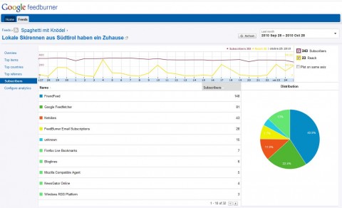
Feedburner is a service for webmasters and website owners to track their RSS-Feed subscribers and much more. RSS did not make it to the general public as everyone hoped, but still are very important. Google bought the company behind Feedburner a couple of years ago and beyond a small integration into Google Analytics and Google Adsense nothing happened for years. Today I spotted the "Try the new beta" and here are some screenshots of the interface.

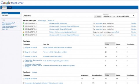
The new Dashboard features messages, your top items and top feeds.

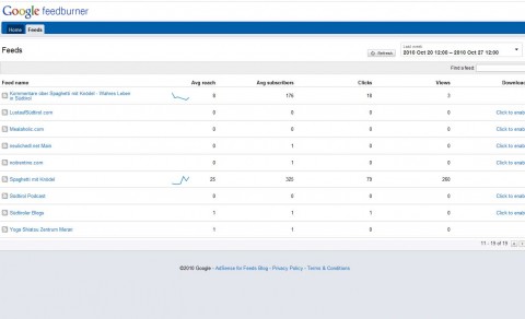
The Feed list features a neat little graph of your reach. Note if you have more clicks than views you are using your rss feed on Twitter or Facebook.

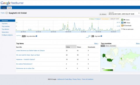
The Feed overview is very well structured and gives you the ability to hide values from the chart. At the moment if you select all time in the date selector it shows only the last two month - I hope they will import the old data over from the classic Interface. But it's proof that they build it from scratch since they clearly have a new database as source.

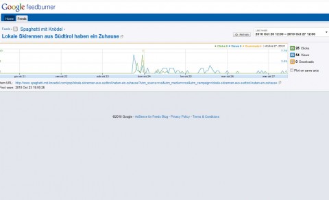
The single Item display does not show much - but I'm sure they will improve this.

The Subscriber overview has just got more colorful, nothing special I can see here.

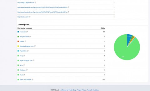
This on the other side is interesting. It shows you the endpoints (formerly known as "USE") where your items have been shown and clicked. It would be great if you could reach out to the url shorteners and import their data as well to see effective endpoints even for shortened urls.

All in all it loads quite fast and works well. It gives me a better overview and maybe I start to analyze my feed stats again.

The Too Small Font Issue

In the last lessons I talked about the mindset of an art director. It's different from a graphic designer in many aspects. It is often difficult to explain what is different, so I will try to make an example - a situation that every graphic designer who is working not just for himself has faced. The "too small font issue".

The font is not small, is elegant

Picture this; you have to do a brochure or an image folder. You have a nice brief and the text is ok. Everything is set, you start doing the layout. You choose the colors, the font, and the images to use a make a nice modern layout. The client has no clear Corporate Design (and if, who cares anyway, this is about image and not rules). The layout reflects the latest trend in modern graphic design, but you adjusted it a little to the audience of your client - you used the minimal style instead of the grunge ;-)

Now you present the work to your client and guess what - he rejects it. At first you will ask what he didn't like and he will give you some really bizarre answers. If you have a client that is used to handle graphic designers he will immediately state that the font is too small. You might say: "No, its 8pt, that's pretty large. I have absolutely no problem reading it. And by the way, it's not small, it's elegant." In the end you will have to increase the size of the texts. You don't want to lose the client, but you are also fed up, so you do as little as you can to change the layout.

Causing problems

The biggest problem of such a situation is, that you didn't discuss about content but problems. You did not discuss with you client about the great graphical idea you had. You caused your client a problem, because he could probably not read the text. Or if he could, maybe his clients are mid-agers around 50 - and they for sure have a problem with a font in 8pt. You are now in the eyes of the client a problem maker and not a problem solution and this is not good for further business.

Avoiding problems

An art director knows ahead what problems could arise and what could distract the client from thinking of him as a great problem solver and communicator. He knows that a bad presentation is killing the idea and not readable text is a red flag for executives and even worse for the consumer. No white text on light gray background, no all caps text ... you know all the cool stuff. But in the end you have to think about delivering the message. It's your job to not make it boring, but it's not your job to make it an effort to get the message. A design can be elegant even with big letters; you just have to design it right. And think always, styling trends are like fashion - they change every couple of years. If you look back on some layouts you made in the past you will think about the colors or the pictures, but I'm sure you will not notice how big a font was.