Identity — Product Management UX/UI & Interacion Blog — Frank derFrankie Neulichedl

Identity

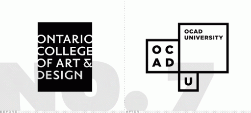
Best new Corporate Identities of 2011

I like this list, and especially that you could vote on the "before" logo as well. And there are more than one example where the old logo has got just as much votes as the new one. This means IMO that many re-designs are motivated by changes on the management level of the company/firm/... and not driven by necessity.

#corporate #identity #design

Reshared post from +Ian Hex

And now time for Part 2 from Brand New, this time: The Best Identities of 2011 -> http://goo.gl/UX8Wv

Of all the ones listed, I love, love, love the new OCAD University identity, because it embodies everything that should be done in modern-day identity design: it's simple and timeless, yet typographically pure, totally fluid, flexible and has a near limitless range of application; it's doesn't have to be consistent because it's coherent.

To be sure to check these out.

Also, happy to see the Little Chef redesign got on there.

#hex_logos-identities

Google+: View post on Google+

Judging an Corporate Identity by the logo

I love identities - I've designed several big ones and love most the "system" aspect of it. A corporate identity is not only a logo, but the combination of typography, logo and graphical elements applied to many different media and form factors. Most of the time you don't even know all the applications of the identity when you start or deploy it. I find it ridiculous to judge an identity by only seeing the logo and maybe one more application - whatever application might be. But it's often done - like in this article on creative review where close to 200 "designers" mock an advertising agency and their work without knowing the background or the briefing for the redesign and by seeing only one tiny little piece of the work.

#CI #Identity #review #britishgas

Embedded Link

Creative Review - New British Gas logo: a sign of the future? The best in visual communication

Google+: View post on Google+

Occupy Wall Street has it's grassroot visual language

This website aims to build the visual language for the 99% movement, also known as Occupy Wallstreet. I find the idea interesting, and the icons are functional and the designs clear. But it also conveys that the 99% is a dull nameless mass - which is in my opinion in conflict with the diversity of opinions and goals of this heterogenous movement.

The website states that they try to unite the movement with an unified graphic language - but at the moment the language is not very unique. I think that the lowest denominator is not the best approach and there might be need for more thought and variety.

#OWS #design #Identity #style

Embedded Link

OccupyDesign Building a visual language for the 99%, grassroots style. Infographic + other protest signs, logistical signage, and universal icons to support the Occupy Together movement.

Google+: View post on Google+