Don't simulate real world objects in digital design
This is a great article for designers and users - balanced and well thought out. What it doesn't cover is why Apple and other firms are going towards skeuomorphic designs - maybe because they try to make technology for the "rest of us" by emulating the things "the rest of us" used in the past. This way we hinder real innovation, because this is not re-thinking a solution. #apple #design #UI
Embedded Link
Why Siri is like skeuomorphic UIs: the magic is just skin deep By now you've probably heard of the widely reported case of Siri's alleged pro-life stance. Walking the dogs this morning, I thought through what I
Google+: View post on Google+
Good UI and webdesign does not mean prettier design
Good interaction design has nothing to do with looks. Some interfaces look dreadful but work great, some look great but are painful to use. I often have to argue with fellow designers about how pretty or good looking a certain design is. Not only old school designers coming form print design (where I had the same discussions) have the impression that if something looks good, orderly and clean it also works well.
Even going beyond the taste of what looks good I often argue that the looks are a secondary thing and that we have to concentrate on the goal of the project - may it be to convey a message or to perform a task.
Google for example has been the posterchild for not being able to pull of a decent user interface - while the search page is probably one of the best UI decisions ever made.
Designers should remember that visual elements are meant to improve the user experience - looking good is part of that, but if it gets in the way of the goal it's a fail.
I will rest my case with this finding where in a test, the not so good looking vertical list has outperformed the nice grid view. It underlines another point - do test your designs.
#ui #ux #design #visual #testing
Embedded Link
westiseast.co.uk - Product listings - a surprising AB test result
These are the results of an AB test that finished recently on a product listing page - I think you'll find the results surprising.
Google+: View post on Google+
New Google Feedburner UI spotted - a quick overview
Feedburner is a service for webmasters and website owners to track their RSS-Feed subscribers and much more. RSS did not make it to the general public as everyone hoped, but still are very important. Google bought the company behind Feedburner a couple of years ago and beyond a small integration into Google Analytics and Google Adsense nothing happened for years. Today I spotted the "Try the new beta" and here are some screenshots of the interface.
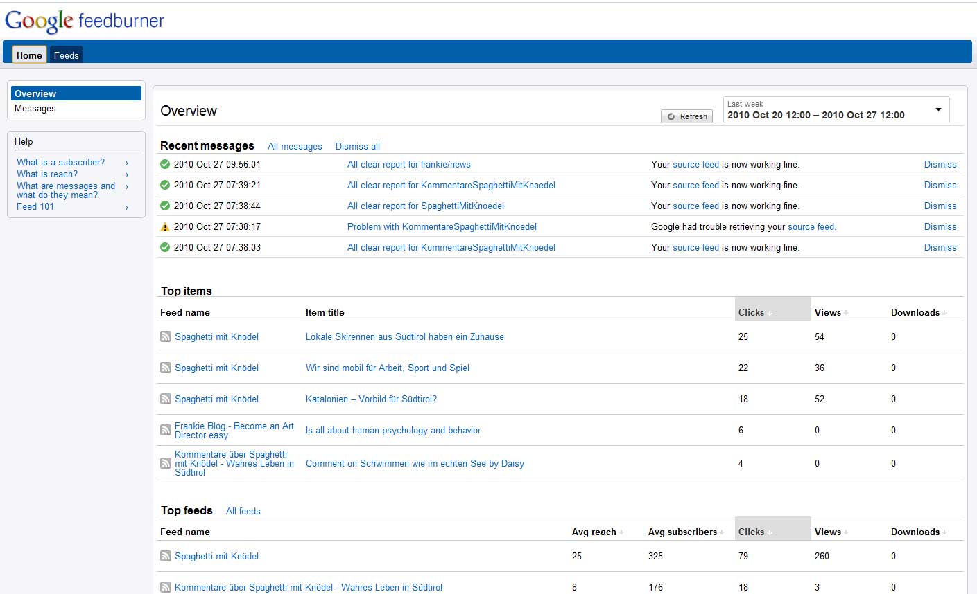
The new Dashboard features messages, your top items and top feeds.

The Feed list features a neat little graph of your reach. Note if you have more clicks than views you are using your rss feed on Twitter or Facebook.
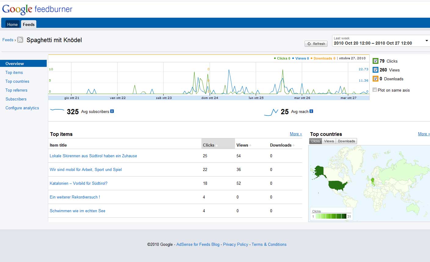
The Feed overview is very well structured and gives you the ability to hide values from the chart. At the moment if you select all time in the date selector it shows only the last two month - I hope they will import the old data over from the classic Interface. But it's proof that they build it from scratch since they clearly have a new database as source.
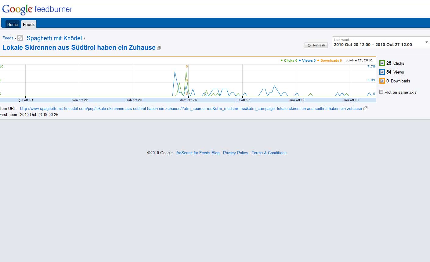
The single Item display does not show much - but I'm sure they will improve this.
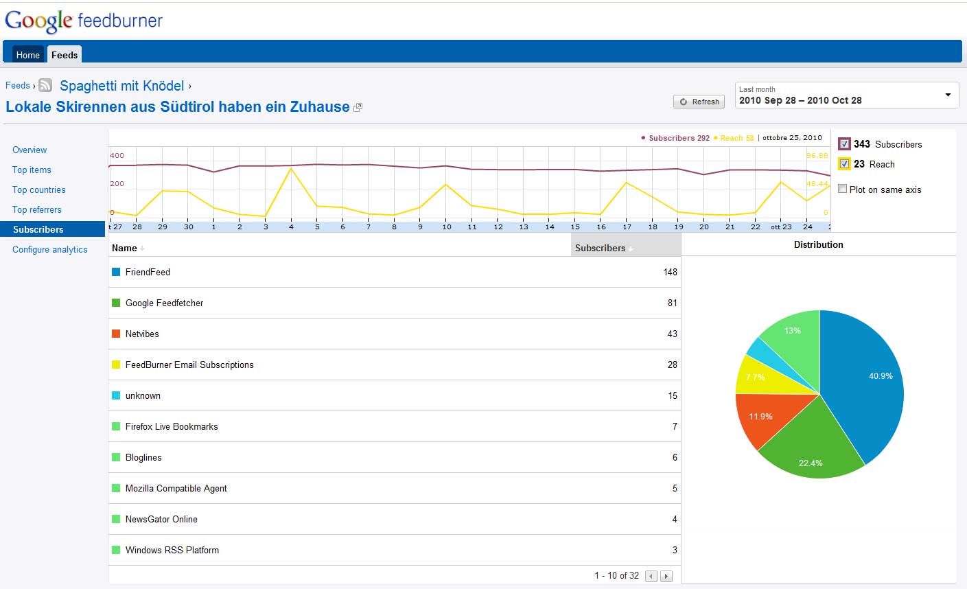
The Subscriber overview has just got more colorful, nothing special I can see here.
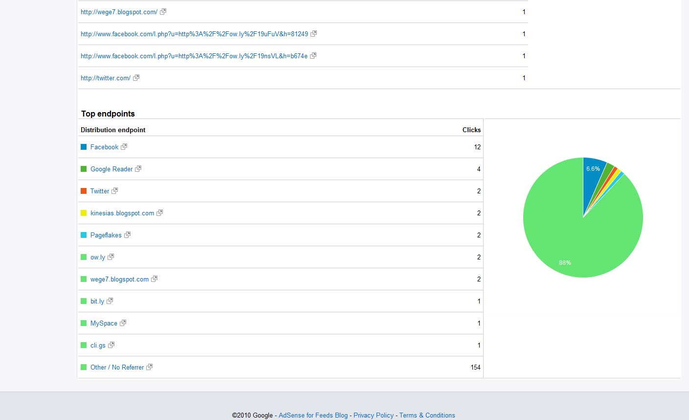
This on the other side is interesting. It shows you the endpoints (formerly known as "USE") where your items have been shown and clicked. It would be great if you could reach out to the url shorteners and import their data as well to see effective endpoints even for shortened urls.
All in all it loads quite fast and works well. It gives me a better overview and maybe I start to analyze my feed stats again.