GoPro VR Plugin installation with Adobe Premiere CC 2019 Quick Fix
Adobe released their new products 😄 with great improvements and as usual new app installations.
This means also updating or re-installing your plugins … and normally developers are quite good at updating the plugins to find new Premiere and After Effects installations - except if your developer stops supporting their products.
Kolor is now a GoPro company and they announced that they will shut down operation and do not support the software anymore. They posted that the VR plugins will be updated within the Fusion package - but as of today these do not install the the plugins correctly.
I fixed the installer by adding the new installation folders and repackaged it - it worked for me - and you can download it here. No guarantee and support give. The software is copyright of GoPro and I will take down this post as soon as the official installer is updated.
Notification overload 🤮 - fixed

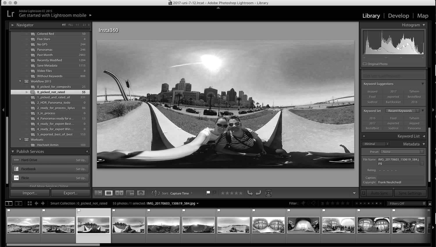
How to fix Insta360 Metadata for 360 VR Photos
Insta360 is a great little company that makes some nice 360 cameras for consumers and professionals. They are very fast to update their software and the software itself is quite nice, but one thing that bothered me from the beginning was that they strip out Metadata of their INSP Files when they stitch them into equirectangular JPGs.
I have a insta360 Air and since it is connected to my phone I have GPS information. I don't see why Insta360 has to strip this information, but they do and they won't add it back in forseable future.
Beyond striping Metadata information there are also some basic tags that are missing and will cause some problems if you want to edit the images - in Lightroom for example.
Exiftool to the rescue. This powerful free tool allows you to add end edit Metadata information - and it is possible to copy Metadata Tags from one File to another. So here are my steps to add back the GPS information and fix the Date Metadata tags.
Note: You need to have Exiftool already installed - find the right version and how to install it on the original website.
<DIR> is the folder where files are located
Import the .INSP files to a folder
Batch convert them with Insta360 Studio to JPG in the same folder
exiftool -tagsfromfile %d%f.insp -gps:all -ext jpg <DIR>
exiftool "-alldates<filename" <DIR>
Now if we could automate the sticthing as well we could automate the whole workflow, but I guess this will already help.
I hope this will inspire you to find some way to improve your workflow and embrace exiftool like I did 😄
Addendum 30.5.2019
I have written more scripts since I wrote this post and started to collect them on Github to make them accessible to more people. If you liked this script it may be worth looking at the others as well.
Use Adobe Lightroom to edit 360° Panoramic Photos
Travel Photography Gear Lessons learned during a roadtrip through the USA
Budget Travel Backup Solution for Photographers
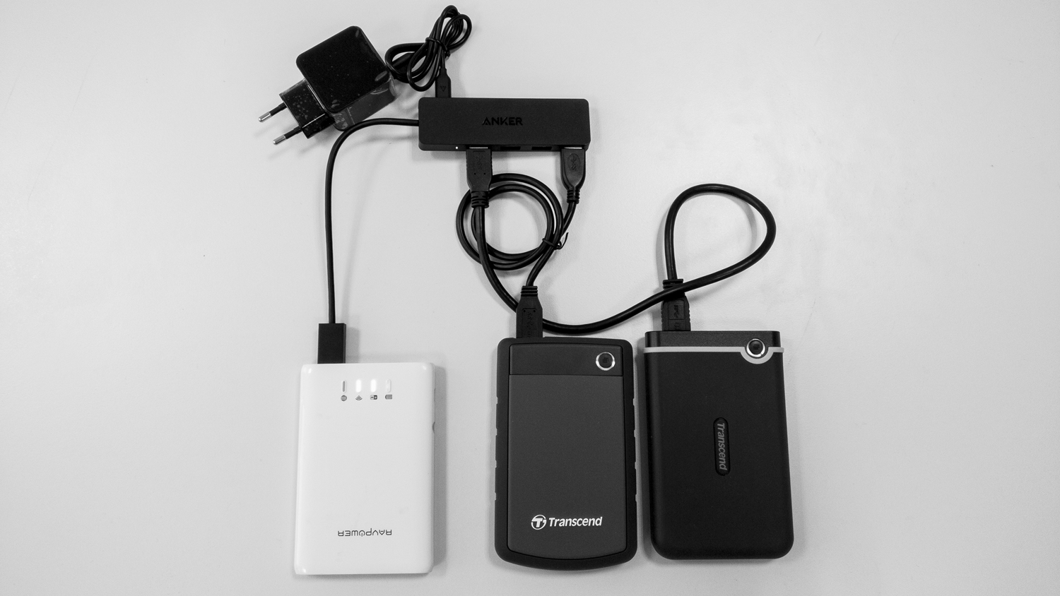
I love photography and I'm paranoid about losing my photos. At home I have several backups (offline and online), but when I traveled I had to hope that the SD Cards wouldn't lose any data. That's why I use some inexpensive components and combine them with some software.
The hardware
This is my budget travel backup solution for photographers.
- RAVPower FileHub V2
- A backup script to automatically backup the sd cards to an USB drive
- 2 Military grade antishock external Harddisks
- Anker Ultra Slim 4 Port - Including Power Adapter
You can get all these for around $200 for 1TB of redundant security, or less if you get a good deal. Which is what other solutions on the market start without any storage.
The FileHub is neat device as it is also a small powerbank - you can strt a short backup session without the need of a plug.
The software
The script is based on another solution, but I had to clean it up a bit and change it for my use. I also added a setup guide and some additional notes on how to use it. It's fairly easy to install and use, so don't be afraid 😉
When cool technology becomes a really useful product - Google Photoscan
I'm interested in photography, cool technology and great products my whole life. This are great things separately - but are really awesome if you combine them.
For example I have collected a lot of pictures which are not digital and I still haven't gotten around to digitise - because it's expensive and or cumbersome - and I worry about them.
I also follow the latest technology trends in imaging and already a couple of years ago I saw a presentation by Google and a University which has shown that they can eliminate glare and other disturbing artefacts in a photo.
Very nice, but how to use this technology to create a really great product? Well combine them with a need like digitising old photos and you get something awesome.
The video explains all the details much better - so check it out and download the app - it's available for iOS and Android and it's called PHOTOSCAN by Google
Flexbox Defense
A perfect combination of learning CSS Flexbox and a Tower Defense Game :D - Even i get Flexbox now - a bit.
Prevent Feature Creep and Bad Product Requests
Ah very funny and easy to understand guide for the product manager -- to say NO
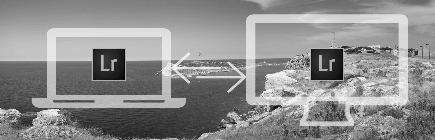
How To use one Lightroom Catalog and Photo Library on multiple computers
Google finally updates it's logo

Google's New Logo Is Its Biggest Update In 16 Years http://feedproxy.google.com/~r/fastcodesign/feed/~3/AFY9z_lwHXw/googles-new-logo-is-its-biggest-update-in-16-years
Redesign of largest Android Platform - AndroidPit
Case Study - Buzzinga Rewards App

UI, UX: Who Does What? A Designer's Guide To The Tech Industry | Co.Design | business + design
Great article on showing the differences of the new role names in the industry, and in the comments the confusion even in design professionals they cause.
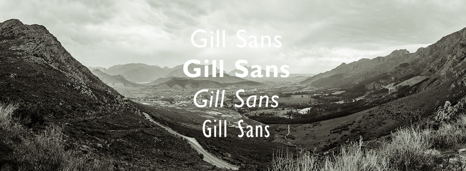
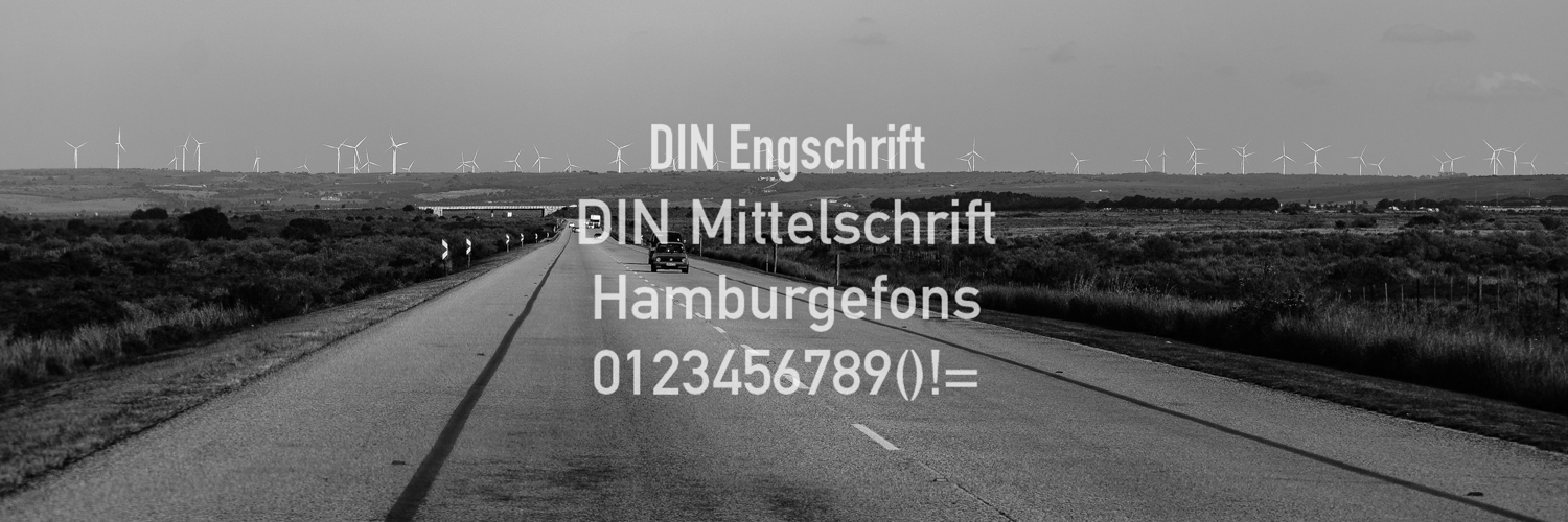
10+ Alternatives similar to the font DIN
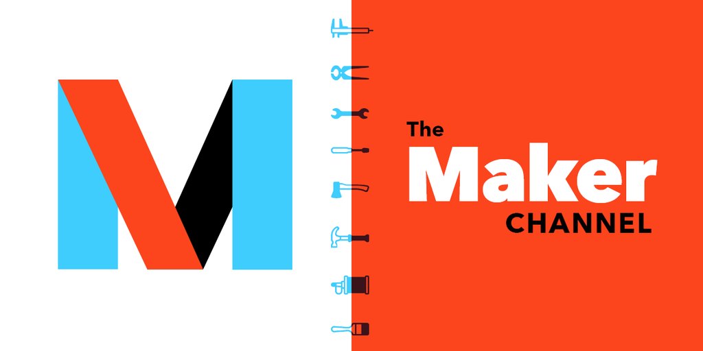
The biggest IFTTT Channel yet - Maker
I love IFTTT and use it a lot. I also love to tinker with some web projects, and now I can combine both.
Integrating API's of services like Google Drive, Dropbox is somehow a pain. The maker channel from IFTTT is now the bridge to those and 193 more channels. This opens a lot of possibilities, from sending email, storing files, collecting data, opening garage doors etc.
I especially like that you can use the DO companion apps on your mobile phone to trigger events or even collect data for your own service.
Maker Channel
The Maker Channel allows you to connect IFTTT to your personal DIY projects. With Maker, you can connect a Recipe to any device or service that can make or receive a web request.
Extract Assets Feature - Deprecated
If you want to use Photoshop to generate automatically your assets for iOS or Android Development rejoice. The feature is gone in the new version of Photoshop.
It was flawed but just resigning is not really a good choice IMO.
There was a great discussion on how to improve the feature in the Adobe Forums, and it seems like that the resolution is to just kill the feature and announce it in the thread:
"FYI folks, this feature is now deprecated, we have released Export Options which tackles a smaller scope of problems of exporting. More info is available here: https://helpx.adobe.com/photoshop/using/export-artboards-layers.html"
And no - the new feature is not really an enhancement.
Photoshop CC: Extract Assets Feature Is a Disaster (2014.2 update)
The new Extract Assets feature in Photoshop CC 2014 is a disaster. Take a look at Sketch for the proper way to do this that designers will actually want to use. Problems & Suggestions: 1) Come up with a solution that doesn't mess with my layer or layer group names - let me name the asset in the Extract Assets window and then remember it.
2) Allow me to add padding around an asset when I export - with the flexibility to provide different pa...
Bigger Text is better - for legibility
Very good article that explains why larger text sizes on the web is better for both users and content providers.
You can clearly see the trend in the big content websites - the font sizes are getting bigger - and that's good. Even on mobile. Designers and readers are finally arrived at the point where they understand that using more space might just make the text easier to read and even faster to go through the content even though you have to scroll.
Sizing Up Readability & Legibility « Fonts.com Blog
Print designers who were accustomed to setting type at small sizes—or who still set type at small sizes—should know that when it comes to type on digital displays, bigger is better. Although “big type” on the web has become its own style and even a trend, finding the right type size boils down ...
New collection feature for Google+ finally here
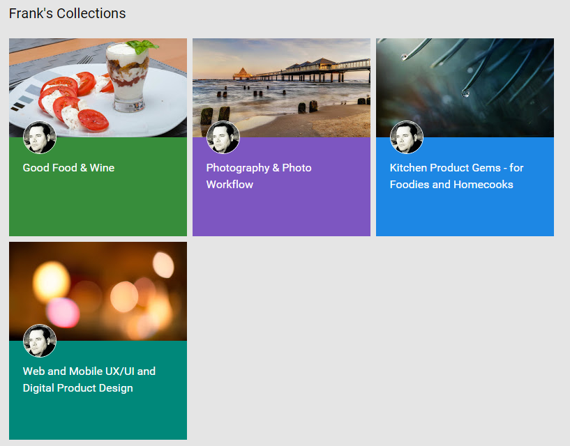
The collections (as many others have said) is the feature we waited for. It might not bring Google+ to the masses, but it will enhance the experience to all of us "afficionados". I created a couple of Collections based on what I share most and if you are just interested in these kind of posts feel free to follow only those collections. I also created 2 foodie related collections which
https://plus.google.com/+FrankNeulichedl/collections
none of you regulars are subscribed to - so if you still want to see those go and get them.
Frank Neulichedl - Beiträge - Google+
Arbeitet als Art Director, Graphic Designer, Mobile Technologies discoverer Wohnt in Berlin Surprise yourself